
Role: Product Designer
Spotify Odyssey
A new feature concept for Spotify that makes music discovery feel like an intentional, curated journey — not a passive algorithm.
Tools: Figma, Claude
Timeline: 10 weeks
Background
This project started as a personal frustration. I use Spotify daily, and I've never been satisfied with it’s ability to introduce me to new music that I actually like. I’ve always felt there was a gap for people like me who want to explore a certain area of music with intention, and care about the context along the way. For people who think of music discovery as something meaningful — an identity, a practice, a conversation — Spotify offers very little.
The brief asked me to add a feature to an existing product. I chose this problem because it felt charged for me, and because I suspected others shared it.
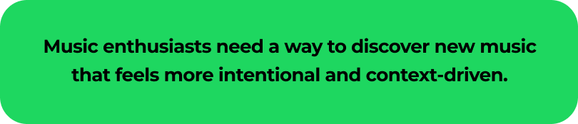
The Problem
Dedicated music listeners need a way to discover new music on Spotify that feels intentional and context-driven — not like something that happened to them while they weren't paying attention.
The Solution
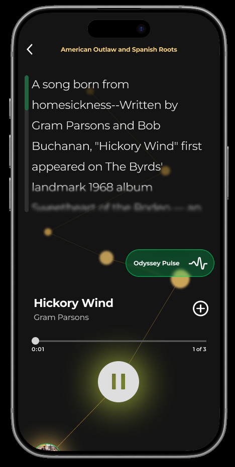
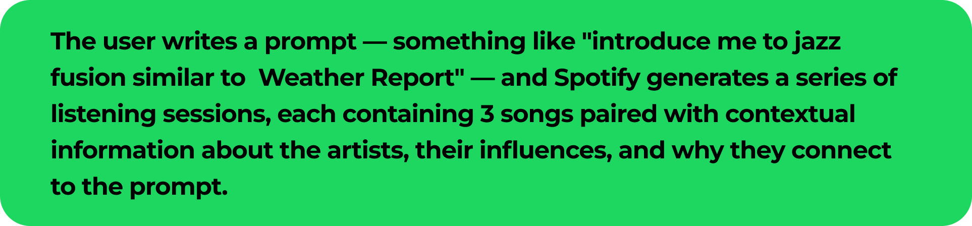
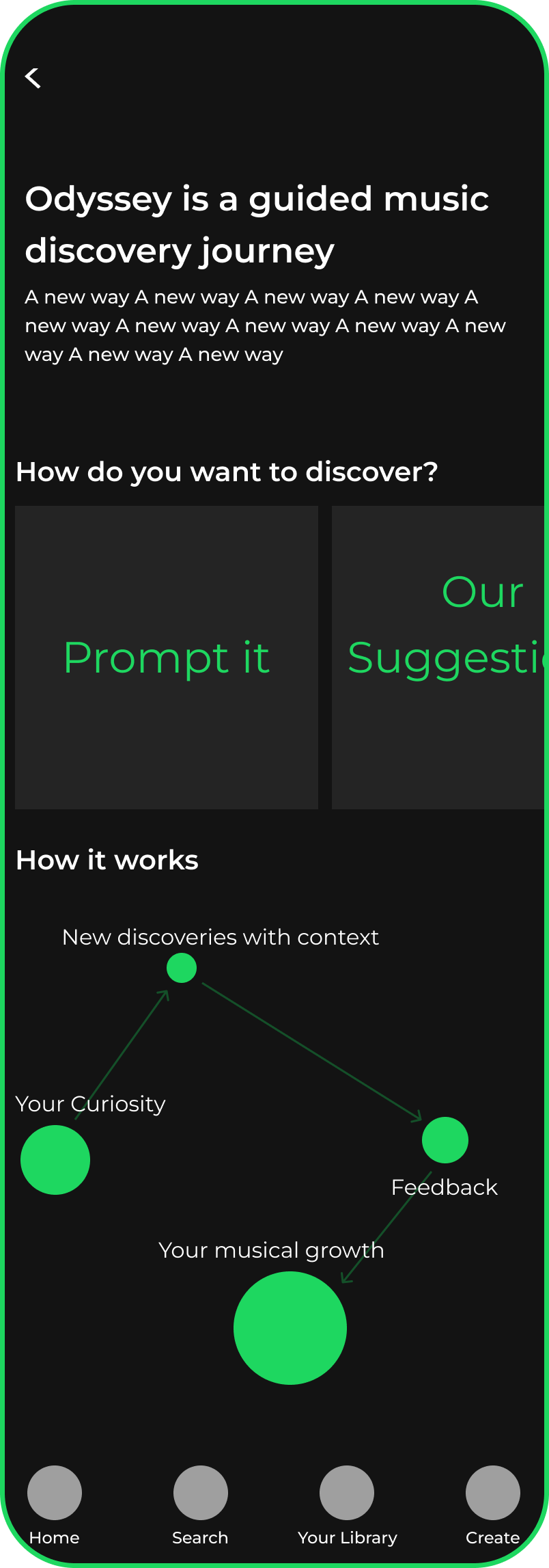
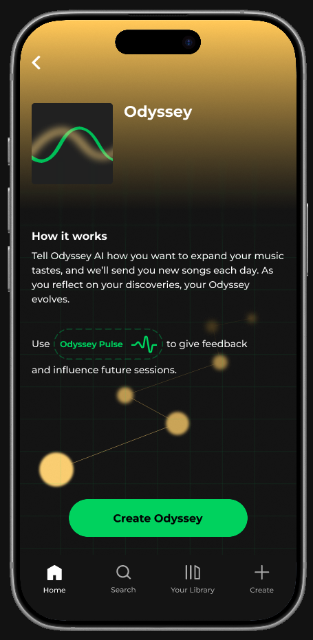
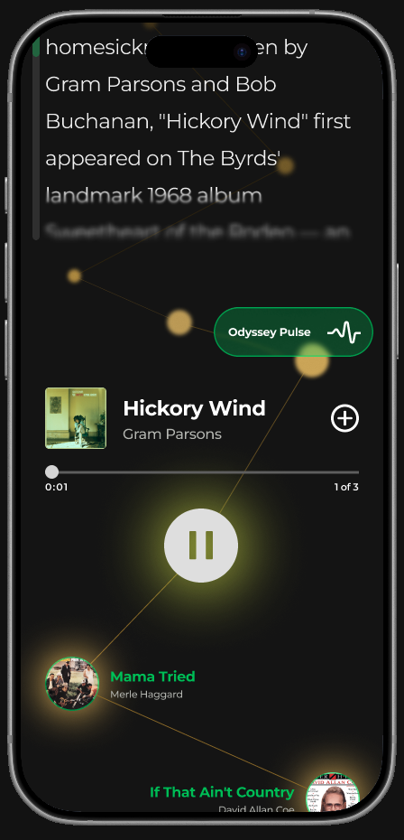
Odyssey — a new Spotify feature that delivers scheduled, AI-guided listening sessions built around a prompt the user writes. Each session pairs unfamiliar songs with contextual information about the artist, the music, and why it connects to what the user already loves. Discovery becomes a thing you do, not a thing that's done to you.
Research
User Interviews
I interviewed 5 music listeners with varying levels of engagement — from casual streamers to musicians who treat discovery as a daily practice. My goal was to understand how people currently find new music, what's working, and where Spotify is falling short.
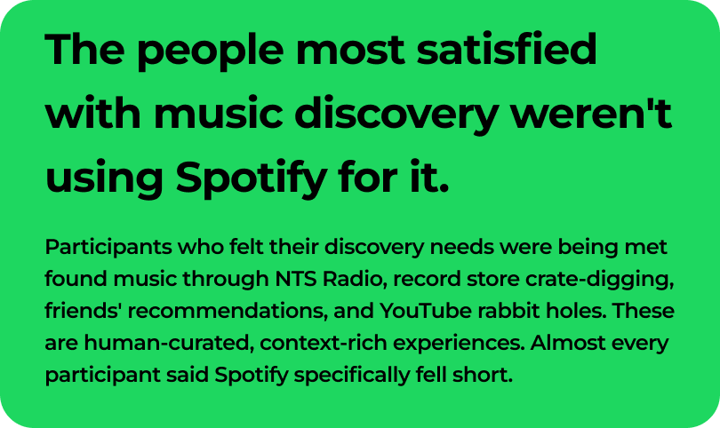
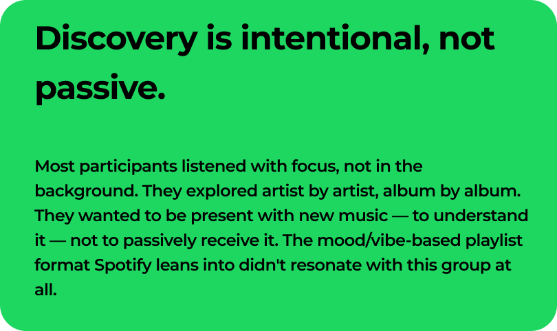
The clearest pattern that emerged was around intentionality. Most participants didn't want music served to them passively — they wanted to seek it out, on their own terms. They went down artist rabbit holes, listened to albums front to back, looked up interviews, and read about producers and influences. The act of discovering music was part of the value. Spotify's algorithms and focus on playlists doesn’t satisfy that.
The other consistent thread was context. Several participants said they regularly went outside Spotify — to Wikipedia, YouTube interviews and music journalism — to learn about music they'd just discovered. That information made the music mean more, and Spotify provided almost none of that.
Insights
These two insights pointed in the same direction: the feature needed to make discovery feel like something the user was actively doing, with a real sense of purpose and information behind it.
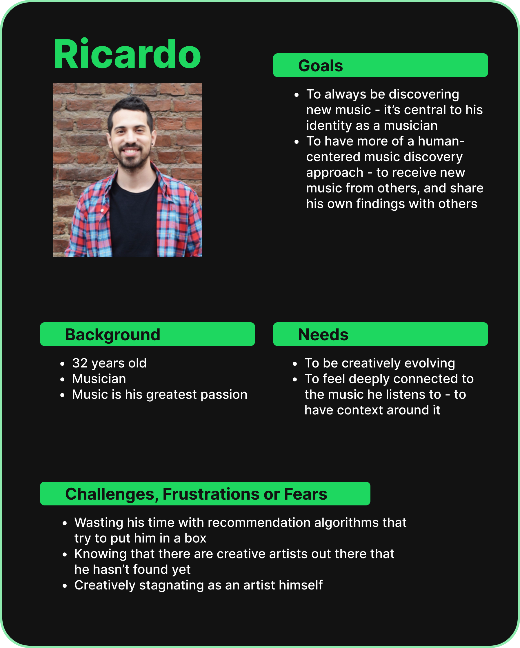
Personas
Ricardo is a 32-year-old musician for whom discovery isn't just a preference — it's central to his creative identity. He represents the user this feature is most directly designed for: someone for whom Spotify's current offering is a genuine source of frustration, and for whom getting discovery right would be genuinely meaningful.
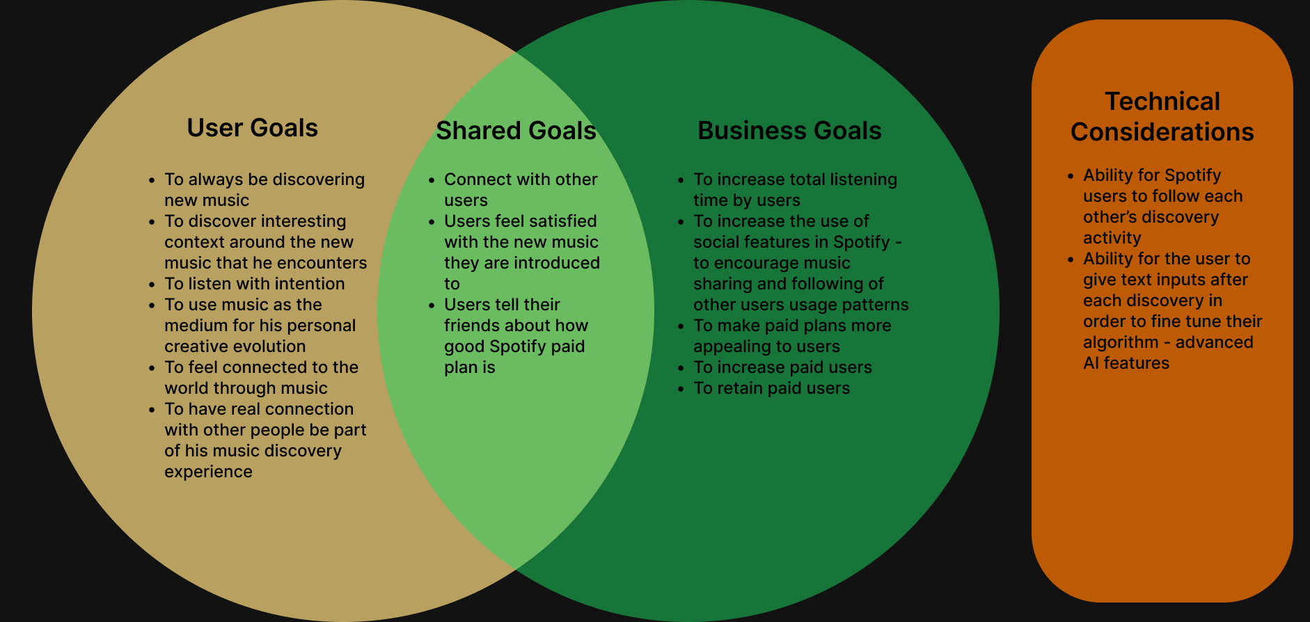
Project Goals
Ideation
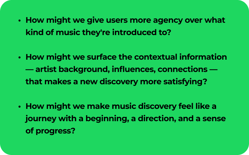
The Problem Statement
“How might we” Questions
Design strategy

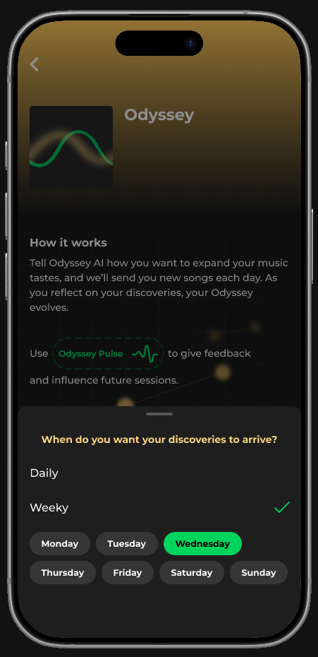
Because Odyssey lives inside an existing product with an established design language, the feature needed to feel native — not bolted on. My working principle throughout the entire design process was that 80% of every screen should feel like Spotify, and 20% should feel like something new. I started by cloning existing Spotify screens and building outward from them: matching type scale, spacing, and interaction patterns that users already knew.
From that foundation, I asked: what's the one thing on this screen I can change to make it feel like Odyssey?
This constraint made the design stronger. It forced specificity — each departure from Spotify's conventions had to be intentional and earn its place.
Defining the Solution
The Feature
Getting to this definition took longer than expected. Half-way through the mid-fidelity phase, a combination of testing feedback and the discovery that Spotify had launched a similar AI playlist beta feature made me question whether the concept had enough differentiation.
The question my mentor pushed me on was one I hadn't answered clearly enough:
is this a playlist, a live radio show, or something else entirely?
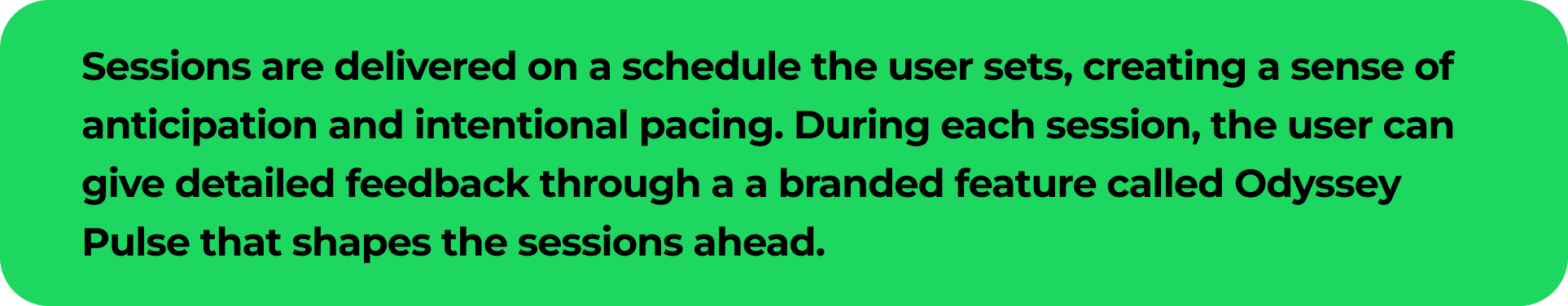
Answering that question changed the design. A playlist is passive — a list of songs you can play whenever. A radio show is live and linear, but you don't create it. Odyssey needed to be something new: a scheduled, prompt-driven journey that the user builds and influences over time, with each session feeling like a chapter.
That distinction had real design implications — it meant sessions needed to feel distinct from each other, that there should be a sense of narrative progression, and that feedback needed to connect visibly to what came next. Once that was clear, the high-fidelity direction became much easier to execute.
User Flows
Low and Mid-fidelity
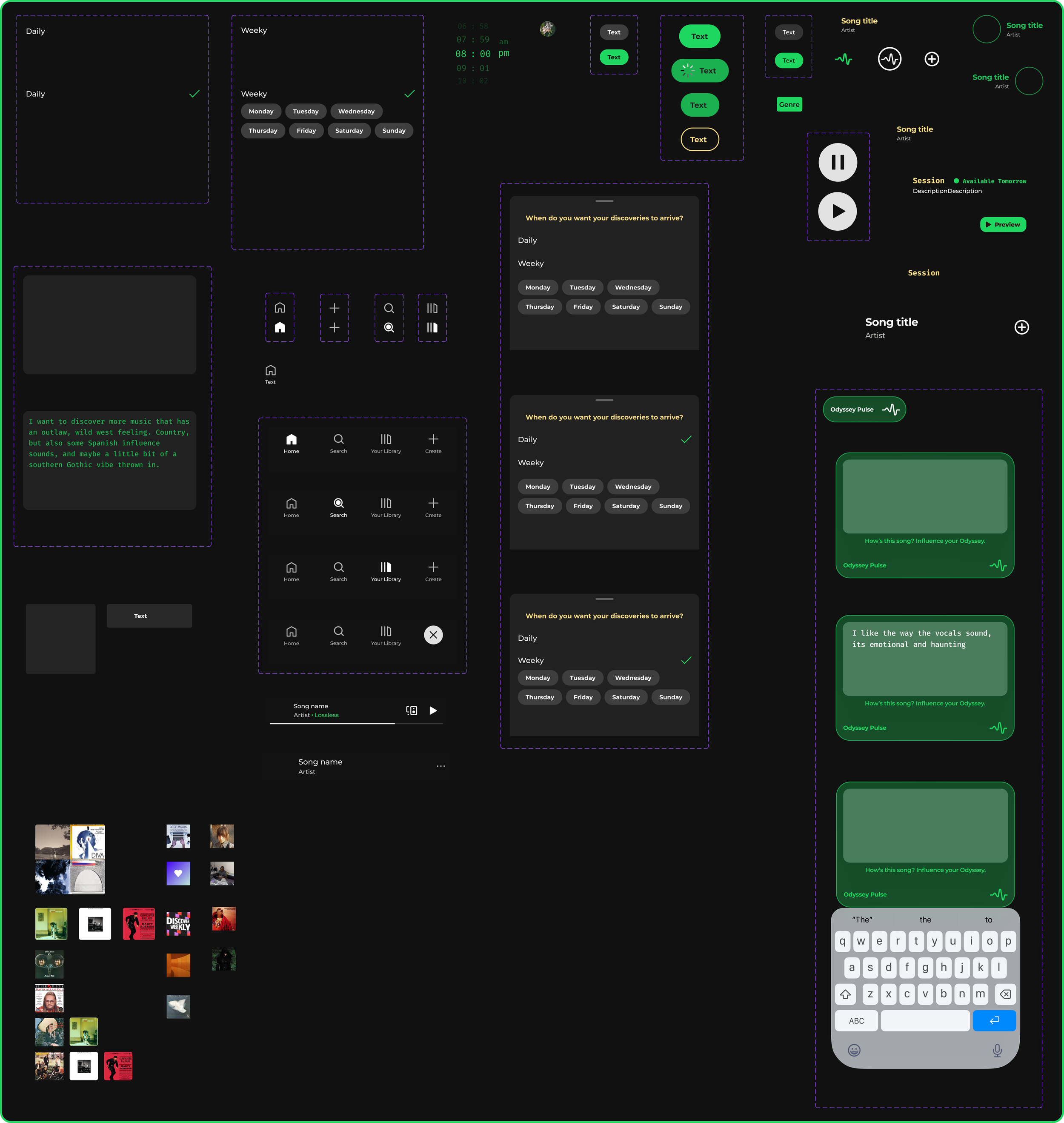
Wire-framing, Low and Mid-fidelity
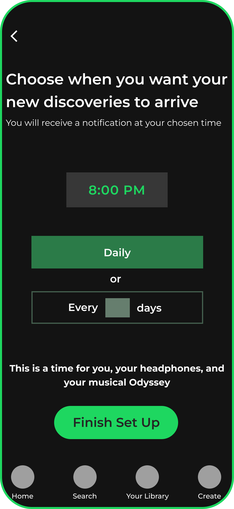
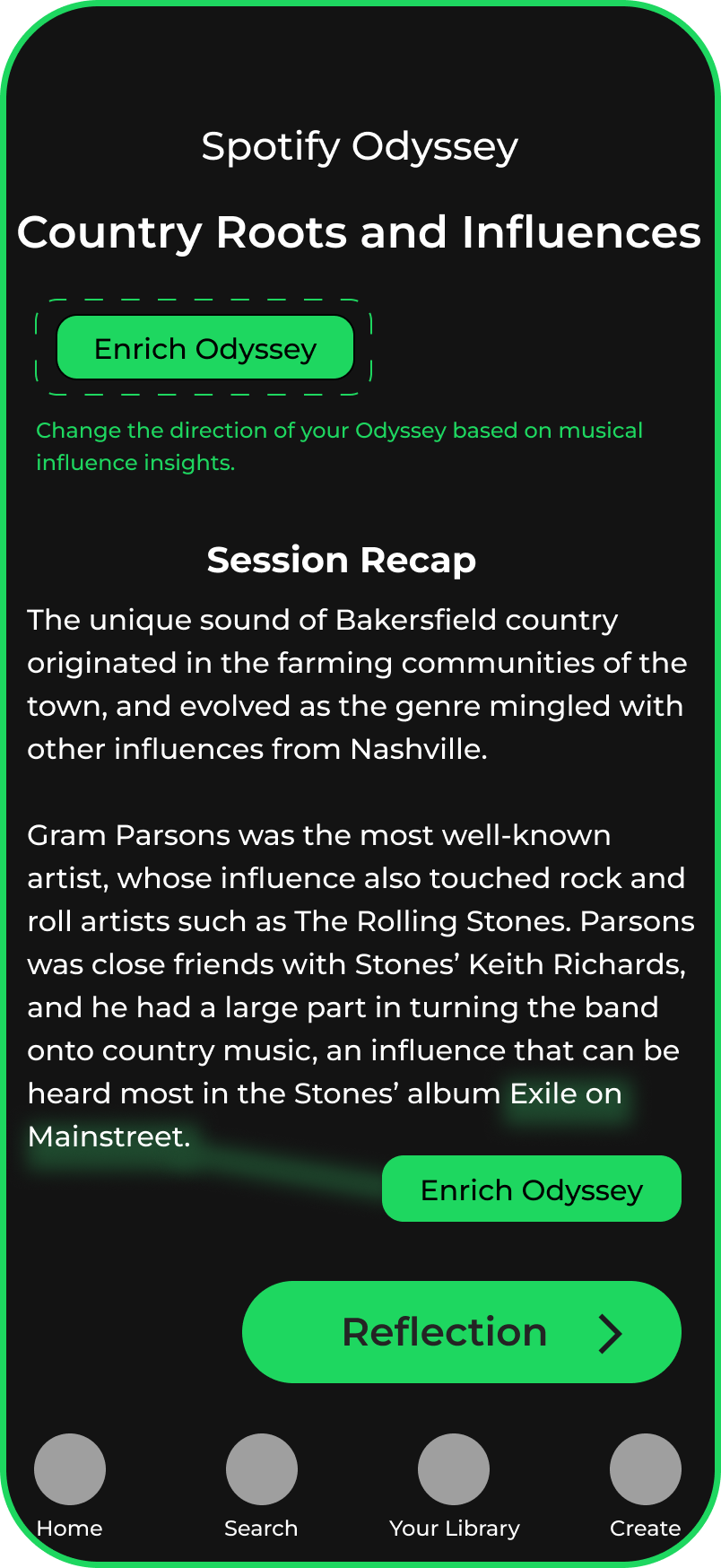
The lo-fi to mid-fi progression was where the structural logic of the feature got worked out. The screens that required the most iteration were the session setup flow and the session recap screen — both of which were tested at lo-fi before moving forward.
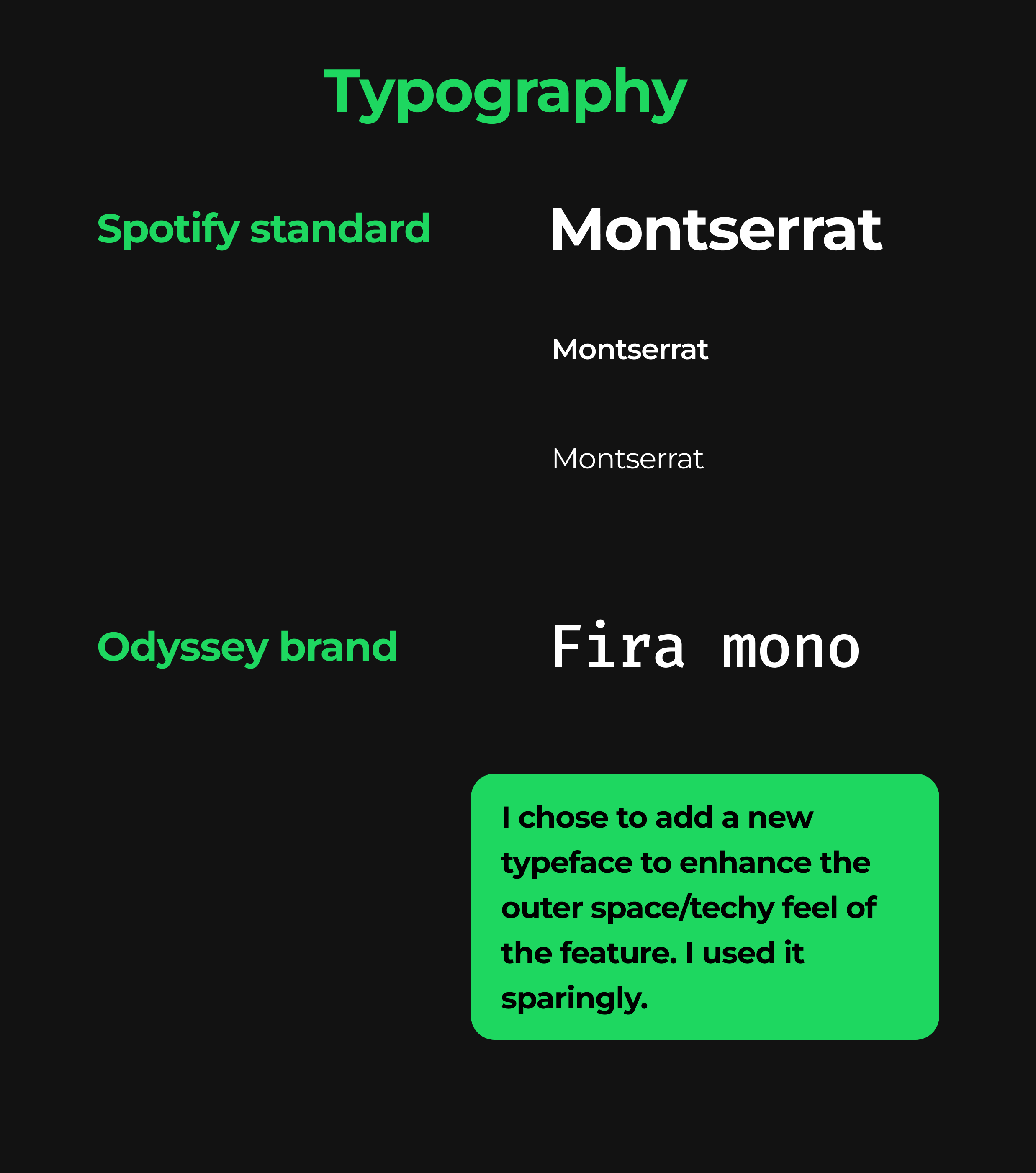
Brand Design
Odyssey needed its own visual identity within Spotify's existing design system. Spotify's palette is predominantly black, white text and their signature green. For Odyssey, I introduced a gold to signal that this was a distinct mode within the app. The goal was to feel premium and immersive — like the app had shifted into a different register.
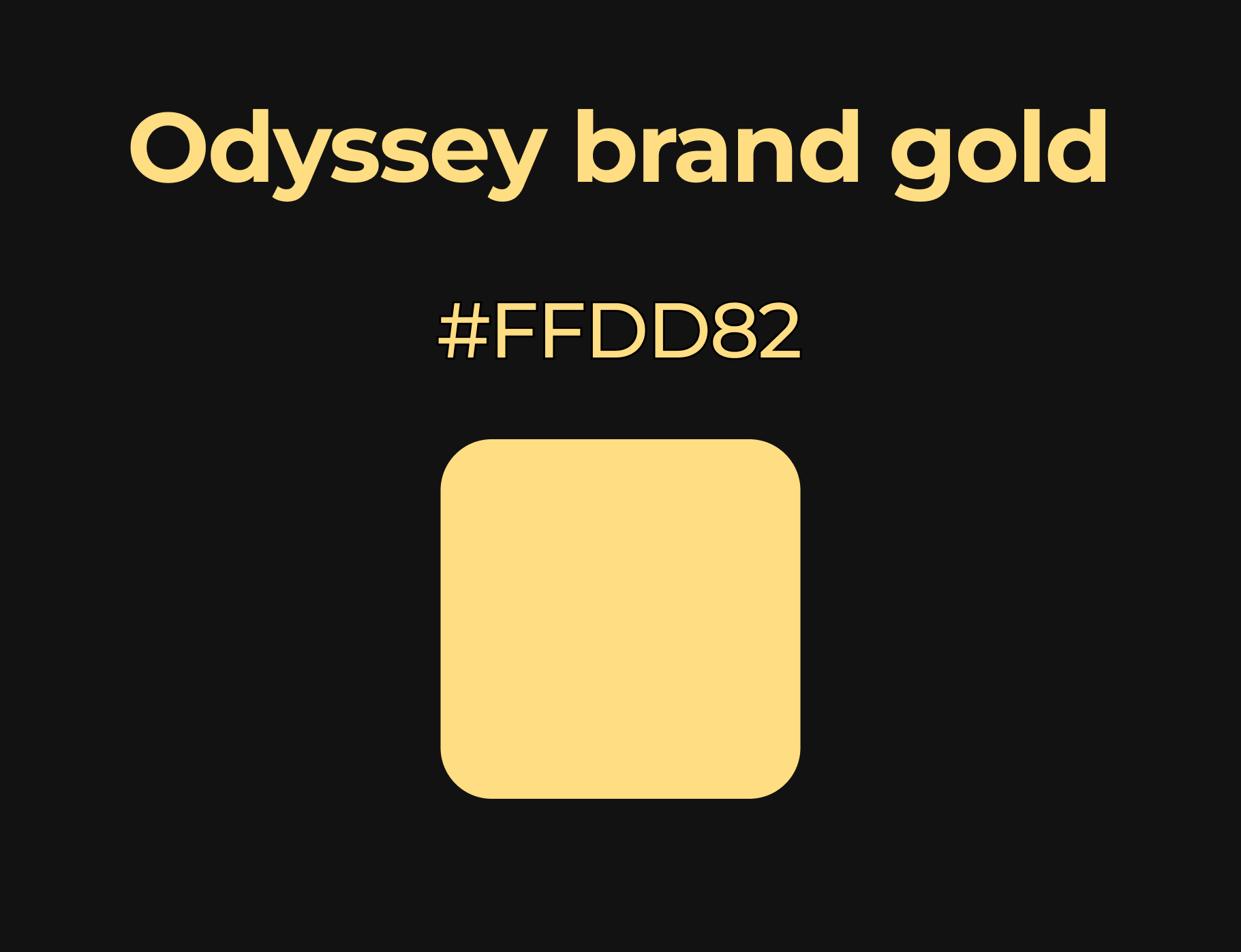

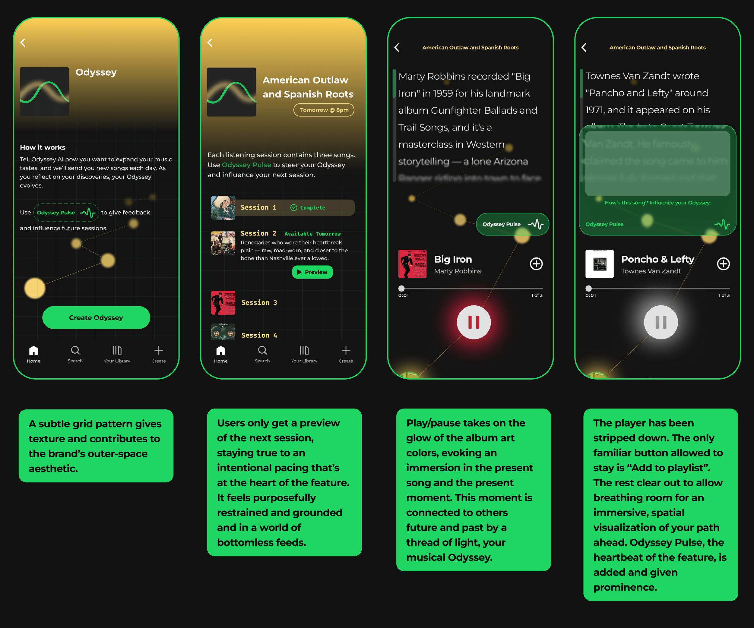
Odyssey Gold evokes exploration, sincerity and excitement. It’s a welcome natural-feeling brightness among Spotify’s otherwise black and unnatural green.
High Fidelity Wireframing


UI Component Library
Prototyping & Usability Testing
I tested across two rounds — lo-fidelity and high-fidelity — with 5 participants each. The two task flows were:
1) Set up a new Odyssey
2) Enjoy a listening session and give feedback on a song.
Iterations made

One participant said he wouldn't use scheduled sessions at all — he'd rather get all the songs in a playlist now. This made me question the scheduled format for a moment, but when I looked at what the other four participants had said, the picture was clearer: the scheduled format was exactly what differentiated Odyssey from a playlist.
The user who didn't want it wasn't the target user. Designing for him would have meant designing away from the core value of the feature. I kept the scheduled sessions.
Final Design
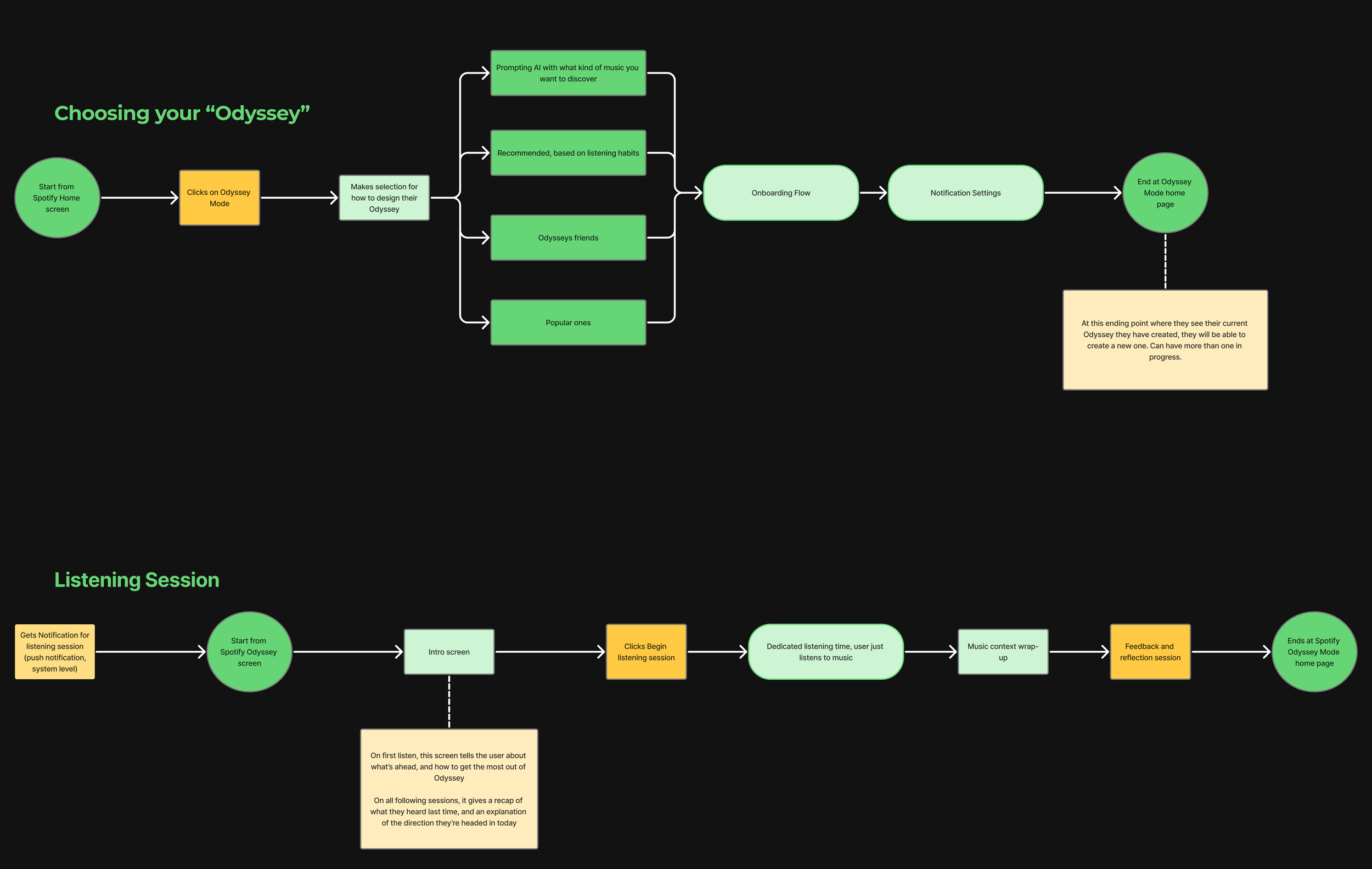
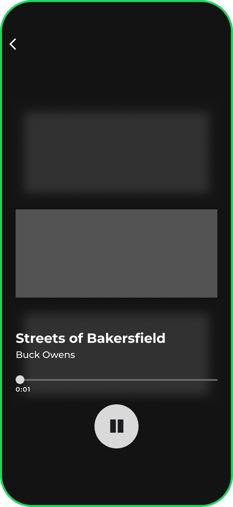
The final prototype covers the full Odyssey experience: discovering the feature on the Spotify home screen, writing a prompt and setting up a new Odyssey, receiving a notification for a listening session, playing through a session with live song context, giving feedback, and viewing the session summary.
Key Learnings
The most important lesson from this project was about the cost of not defining a feature precisely enough before entering high fidelity. Mid-way through the project, I hit a wall: testing feedback raised doubts, and the discovery that Spotify had launched a similar beta feature made me question whether what I was building was differentiated enough. The instinct in that moment was to push forward and figure it out in the design. The better call — which I eventually made — was to stop and answer a set of foundational questions first. Is this a playlist? A radio show? Something else? The answers had design implications I needed to understand before they became hard to change.
I also learned how to work productively within constraints. Designing inside Spotify's existing design system could have felt limiting. Instead, having the 80/20 rule as a working principle made defining Odyssey feel more clear — every screen started from a stable foundation, and every departure from that foundation had to justify itself. That discipline made the feature feel coherent.
What I found most interesting about this project was the challenge of creating something that went against the grain of most consumer apps, in that it asked a person to wait. The fun challenge was to create an experience that slowed a person down, while simultaneously keeping them engaged.
Where the project fell most short was in the visual execution of the player experience. The concept deserved a more robust, interactive 3D rendering to fully convey the intended immersive concept of the “Odyssey path”. Figma just couldn’t properly represent it.