
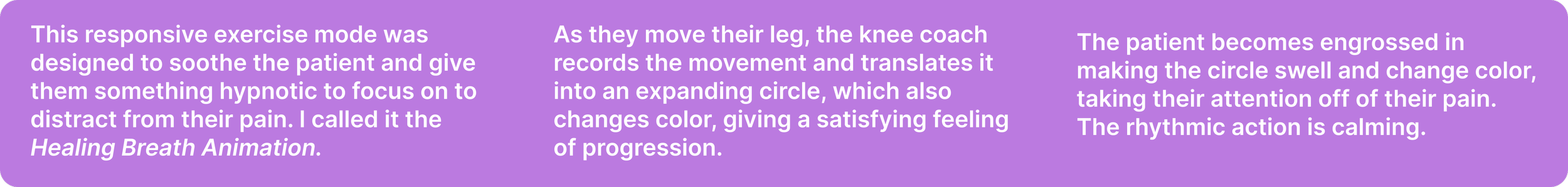
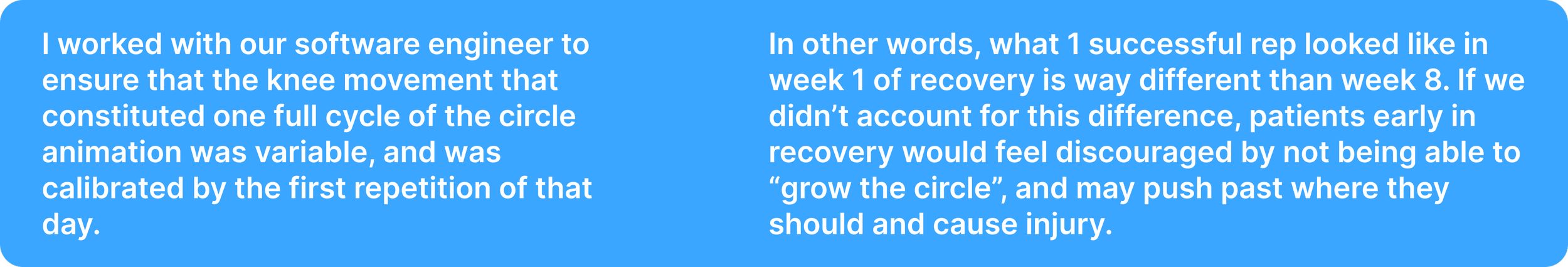
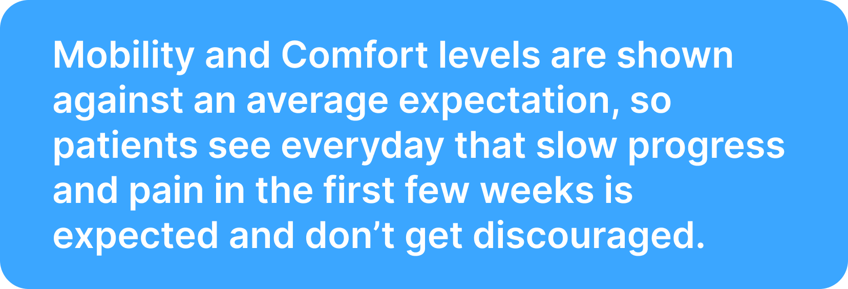
Role: Product Designer
A mobile app for a wearable-augmented knee replacement recovery platform.

This project was for a real client, and eventually evolved to designing the company’s surgeon-facing product as well, and joining the company as the first designer.
Timeline: 12 weeks for (MVP), ongoing
Tools: Figma
Prototype Links: Patient App, Surgeon’s Portal
Background
Each year, roughly 800,000 Americans undergo knee replacement surgery. Between 56 and 64 percent of them don't adhere to their prescribed physical therapy during recovery — which leads to persistent pain, limited mobility, and in some cases a second surgery years later.
The reason most patients don't do their PT isn't that they forget. It's that it hurts. Moving a recently replaced knee joint is painful, and without accountability, it's easy to rationalize skipping it.
Orthini is an orthopedic wearables company building a platform to solve this. The hardware includes the Knee Coach — a fabric sleeve with positional sensors above and below the knee — and a pair of insoles with pressure sensors for scientific gait analysis, a service that used to be exclusive to specialized labs. The devices connect via Bluetooth to the patient's phone and to the Orthini Patient App.
My initial deliverable was the MVP of the Patient App. I later designed the Surgeon's Portal and continued iterating on both as a part of the founding team.
The problem
Knee replacement patients need a way to stay consistent with painful, unfamiliar daily exercises over a long recovery period — without day-to-day accountability from their surgeon.
The solution
A mobile-first guided exercise app that supports patients through their PT routine with structured guidance, real-time wearable feedback, and progress tracking — connected to a surgeon's portal that gives providers visibility into how their patients are actually recovering.
Research


User Interviews
I interviewed 4 people who had done physical therapy to recover from an injury. Because of timeline constraints, I couldn't source participants who had specifically undergone knee replacement surgery — a limitation I was transparent about with the client, who confirmed the research was adequate for this stage. The core challenges of adhering to a regular PT routine are largely the same regardless of the reason for it.
“Patients need affirmation that things are getting better. To see progress."
Going into research, I expected to hear mainly about forgetting to do PT, or not having time for it. What I found instead was that pain was the central variable. The participants who weren't in much pain during PT had little trouble staying consistent — they formed the habit, kept the faith, and got through it. The one participant who experienced real pain had a completely different story. Week after week, it still hurt, and eventually that pain made her doubt the process and the doctor's judgment, and her compliance fell off entirely.
Almost every user of the Orthini app would be in pain when using it.
That meant the design couldn't just be about structure and reminders — it had to actively work against the experience of pain as a reason to quit.
Competitive Analysis
I looked at three existing solutions.
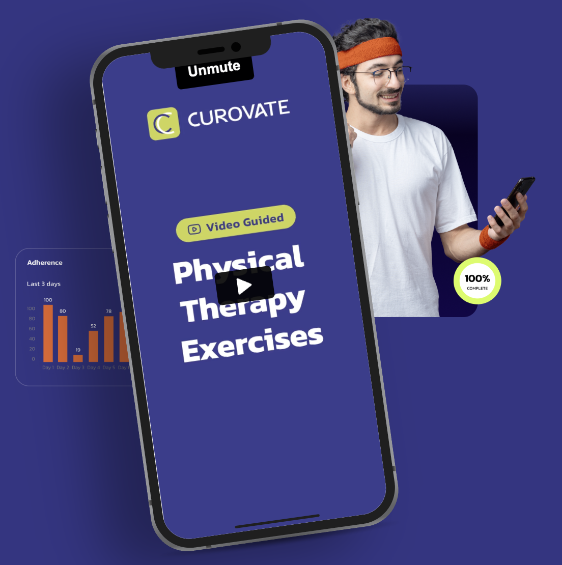
Curovate had a clean, simple app for post-surgery rehab, but its range-of-motion measurement was limited to static snapshots using the phone's own inclinometer — useful, but not a continuous picture of recovery.
KinexCONNECT used a tablet-connected CPM (continuous passive motion) device; the problem is that CPM devices have increasingly been questioned in research for being less effective than active rehab, and potentially causing nerve damage.
Sword Health was the most polished of the three, but aimed at a different problem entirely — preventative MSK health for employers and insurers, not post-surgery recovery.
Personas
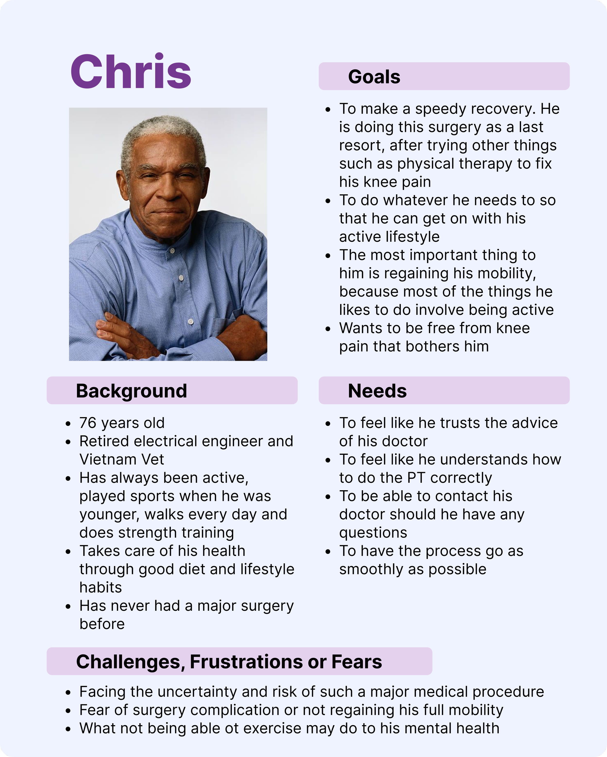
Chris doesn't need much encouragement to do the PT; he just needs to feel confident he's doing it correctly and that his doctor is in his corner.
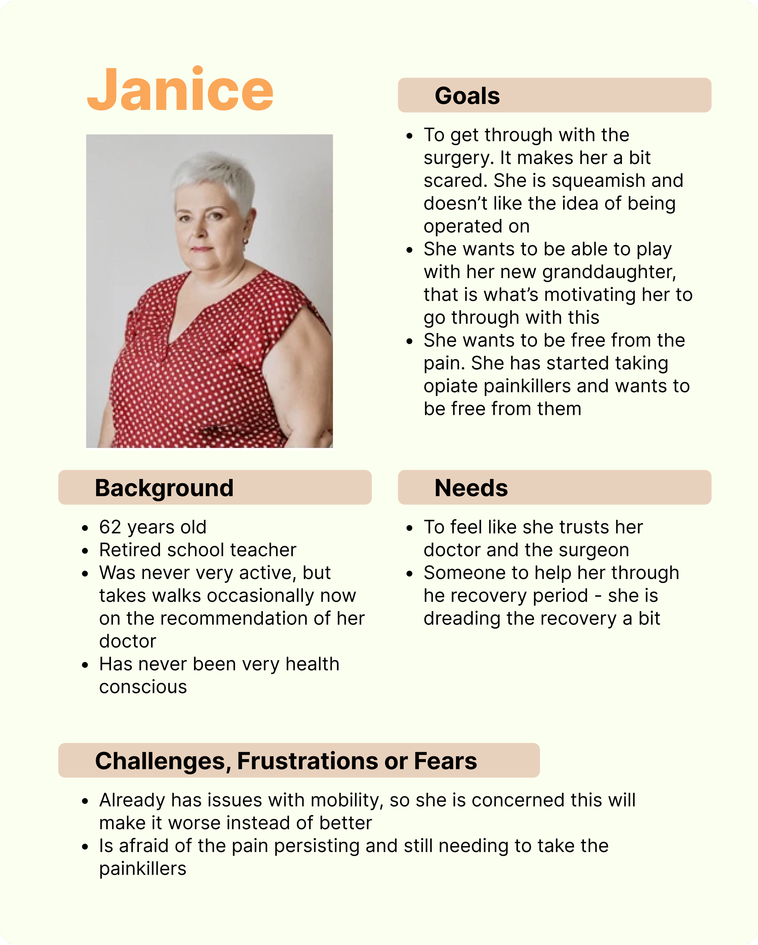
Janice has never been particularly active. She's scared of the surgery and dreading the recovery. She needs reassurance and support at every step.
Insights
The central design challenge emerged: how do you build an encouraging experience for someone who is in pain and doesn't want to do the thing your app is asking them to do?
The answer that research pointed to was progress visibility. If patients could see that their pain was following a predictable arc — that what they were feeling was expected, and that it would improve — they were more likely to push through it. The design needed to make that arc visible and legible at every stage of recovery.
Customer Journey Map
Mapping the patient's journey from surgery to ongoing use of the product helped clarify where the emotional stakes were highest. The first few days at home — in pain, uncertain, using the app for the first time — was the most critical moment. If the first few in-app experiences added confusion on top of an already difficult situation, the product would fail the patient right when they needed it most.
Ideation

Point-of-View Statements
I would like to help knee replacement patients feel encouraged to do their PT despite it being painful, and to help them have an improved relationship to their pain.
I'd like to create an experience that is intuitive and learnable for 50-70 year olds, so it doesn't add friction to an already challenging part of their day.
I would like to create a user experience that includes tracking of a patient’s progress in order to make them feel encouraged to continue their PT.
“How might we” Questions
How might we encourage patients to do something that’s going to be painful?
How might we reframe the patient's pain as a necessary part of their healing journey?
How might we include elements in the user experience like rewarding feedback in order to reinforce a positive experience of PT, despite the patient's experience of pain?
Feature Set
With two distinct users — patients and surgeons — and hardware that was still being prototyped alongside the software, getting the feature set right for the MVP required involvement with the software and hardware engineers.
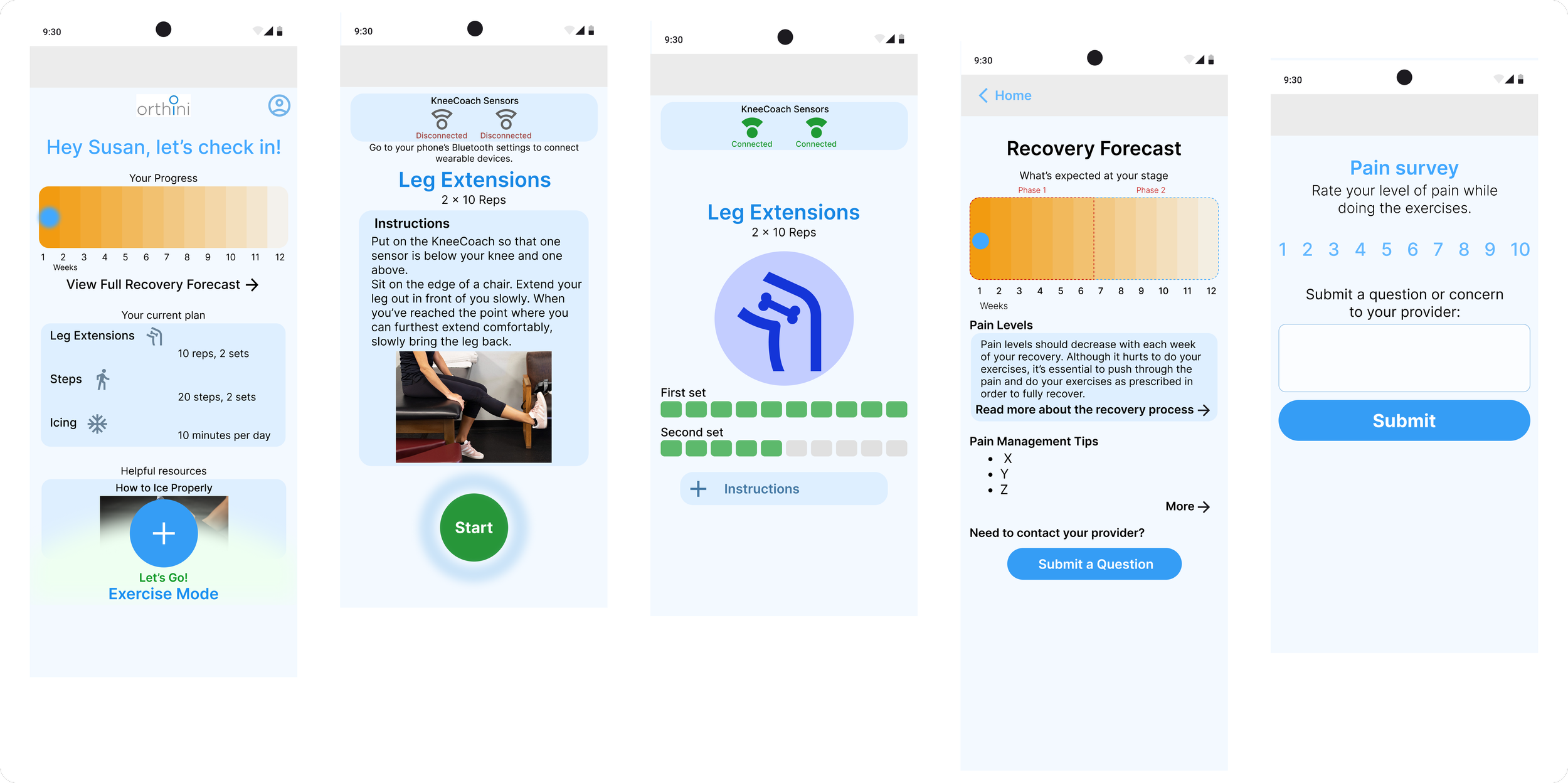
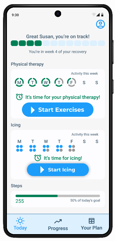
I prioritized must-haves: wearable connection indicators, daily reminder notifications, a pain survey after each session, guided exercises, and a progress tracking section.
Features like gamification, surgeon messaging, and low battery indicators were documented but pushed to a later phase.
One constraint worth noting: I was designing the behavior of hardware that hadn't yet been fully built. I met regularly with the hardware and software engineers to understand what the sensors could and couldn't reliably do — but there was an inherent risk in designing around technology that was still aspirational. I was transparent about this with stakeholders throughout.
Defining the Solution
User Flow
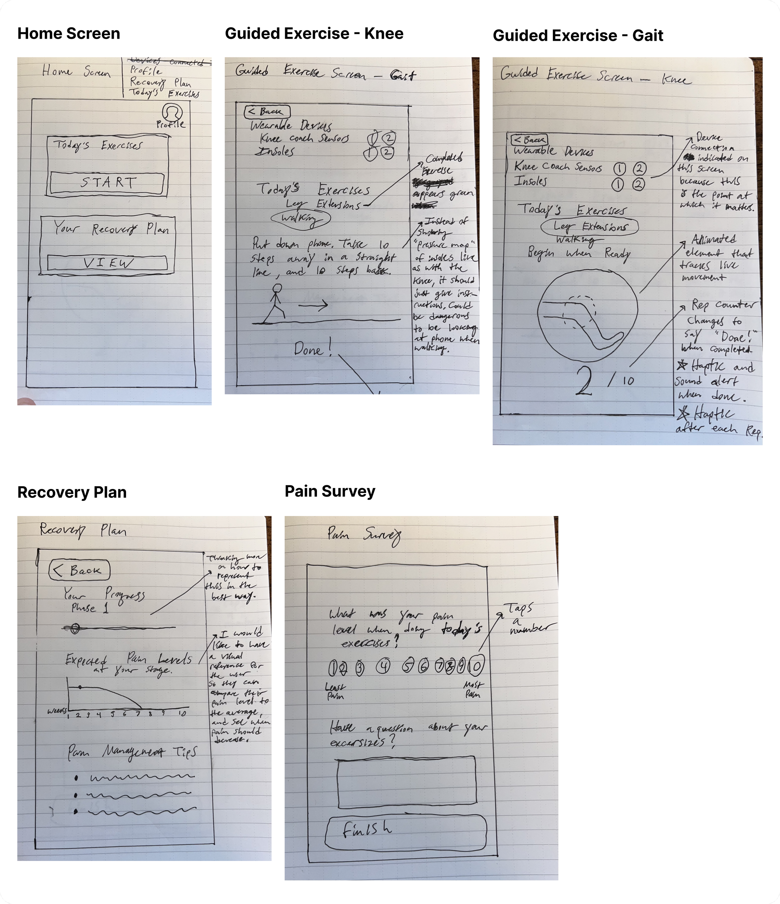
Low and Mid-Fidelity Wireframing
I started with sketches to establish the basic structure of key screens, then moved into Figma for mid-fidelity wireframes. The first round of usability testing was done at this stage, and focused on validating the information architecture and hierarchy before introducing any brand design.
Brand Design
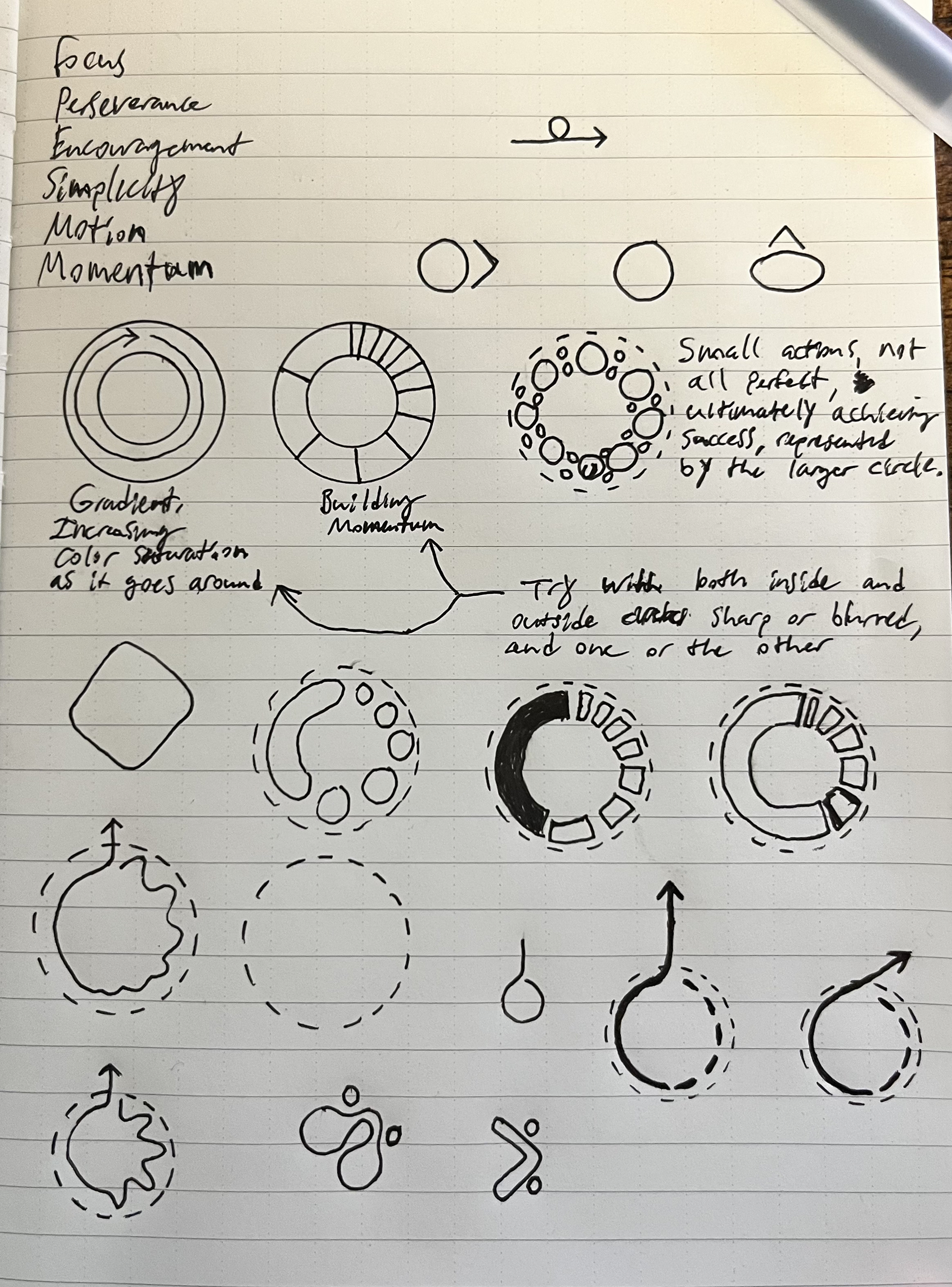
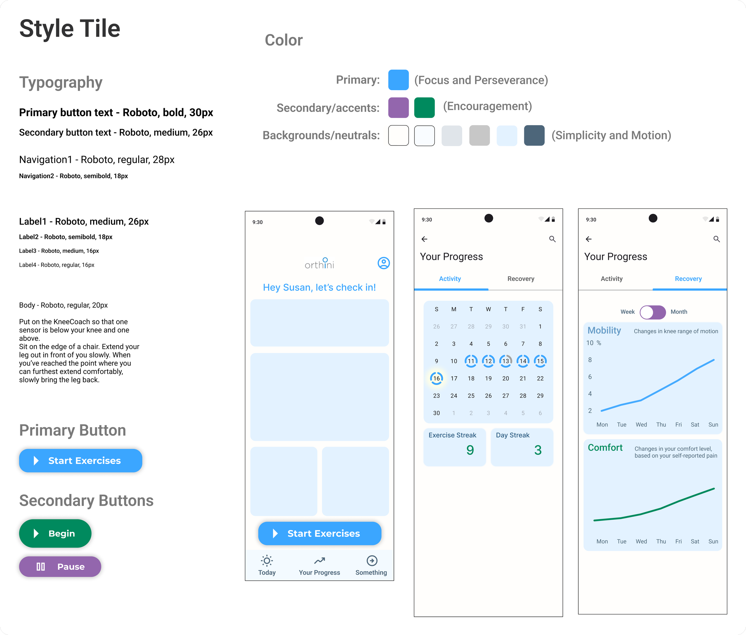
I established brand values (focus, perseverance, encouragement, simplicity, motion), and redesigned the logo from scratch.
The new logo is built around a circle to evoke the name, with increasing sections that progress clockwise — meant to evoke how momentum builds the more you do hard things. It also contains imagery of a horizon, evoking hope in a better future.
I chose a primary brand blue and two secondary colors (green and purple) to give the patient-facing experience some visual energy, since this was a product people would be looking at every day during a difficult period of their life.
Orthini had a single existing brand asset — a wordmark that was six years old.
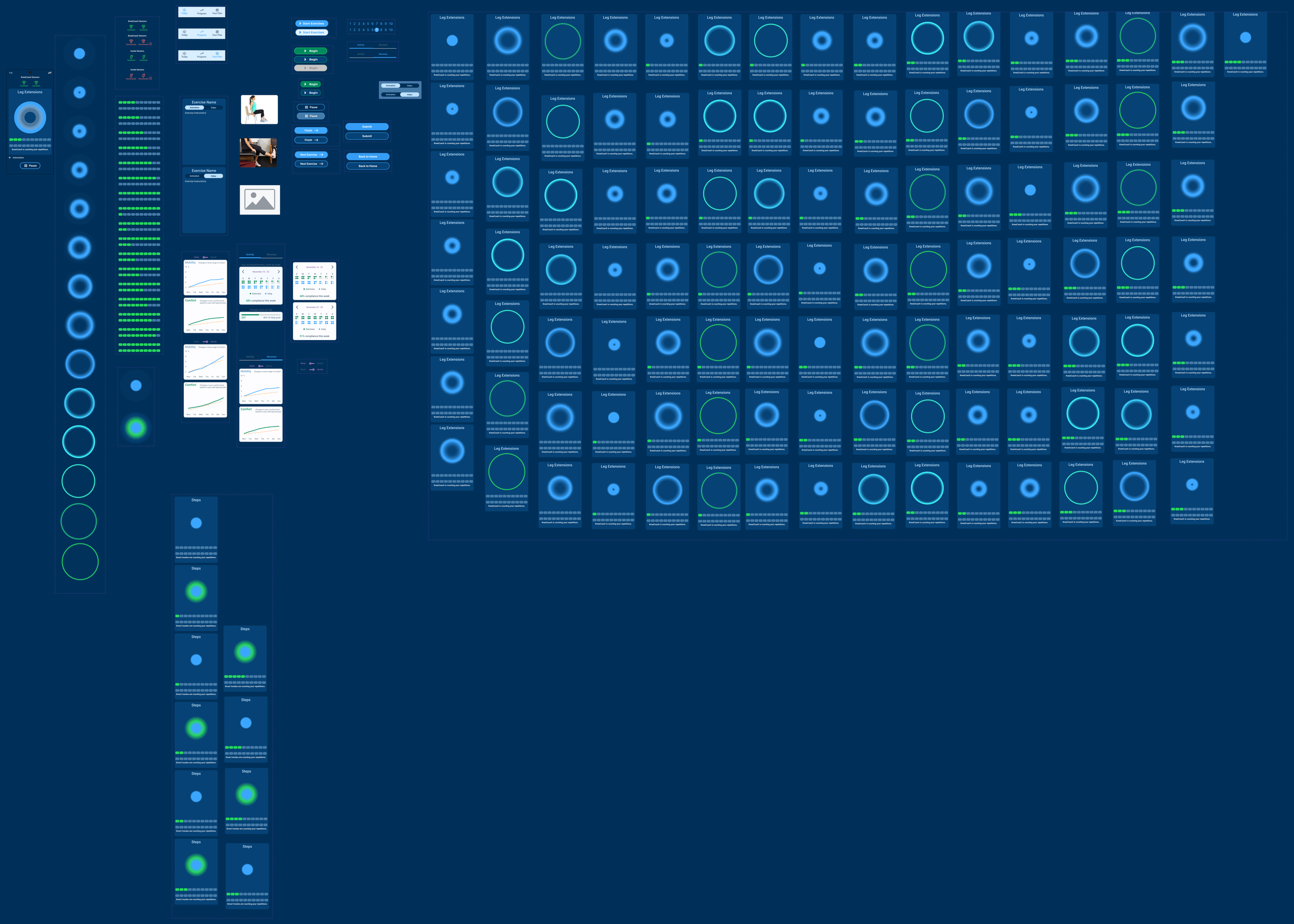
High Fidelity Wireframing


UI Component Library
The library became large as it grew to include components used to prototype animation states as well as reusable components of the design system.
Prototyping & Usability Testing
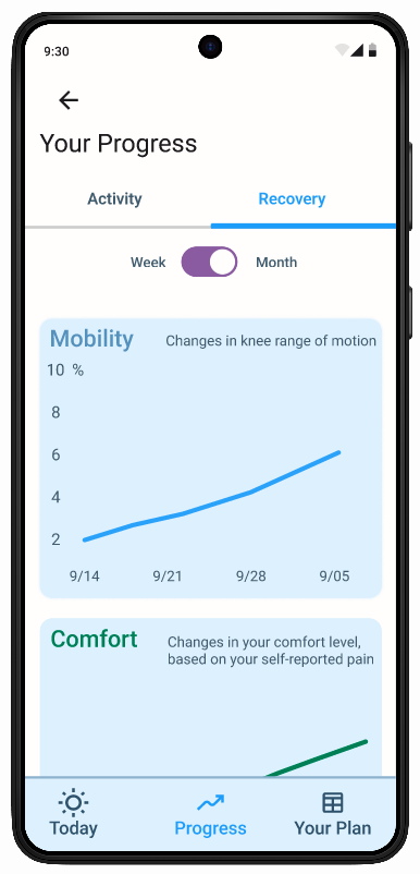
I tested across two rounds — mid-fidelity and high-fidelity — with 5 participants each. Both task flows were the same across rounds: complete today's PT exercises, and find information on how much knee mobility you've regained over the past month.


Mid-Fidelity Testing
What worked
Both task flows were completed without major navigation failures
Participants understood the overall structure of the app quickly
What didn’t work
The large blue "Start Exercise" button captured all of the visual prominence — which meant the Recovery Forecast section, with its smaller text link, went largely unnoticed. When asked to find information about their pain levels, most participants tried to complete the exercises again, or looked for a way to ask the doctor directly. They didn't think to look in the Recovery Forecast.
The naming was also a problem. "Recovery Forecast" read to most participants as something about regaining range of motion — not about expected pain levels. Pain and recovery felt like two different things to them. A few participants also struggled with the "+" icon used to start exercises, interpreting it as "add" rather than "begin."
Decision Point
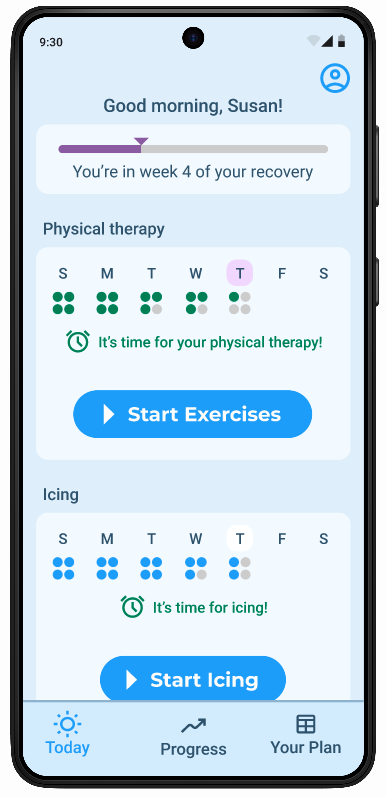
I rethought the home screen for clearer navigation, and to provide encouraging visual representations of progress up front. I removed “exercise mode” as a fixed element at the bottom of the screen and replaced it with a more familiar menu pattern.
High Fidelity Testing
What worked
All 5 participants completed both task flows without significant difficulty • The Progress page in the navigation bar was found immediately •
The overall flow of the exercise experience was well-received
What didn’t work
The high-fi round surfaced mostly visual clarity issues rather than structural ones — a sign the architectural changes from mid-fi had worked. The most consistent feedback was about the home screen's hierarchy and the legibility of several key UI elements:
The progress bar at the top of the home screen — representing weeks into recovery — wasn't understood by multiple participants
The symbols indicating daily PT and icing sessions were too small, and the grey color used for missed sessions blended into the background
The Activity/Recovery toggle on the Progress page took users a long time to notice
The Week/Month toggle was even harder to find, and its visual style resembled an on/off switch rather than two options
The word "Recovery" in the toggle confused one user, who associated it with a rest day rather than recovery from surgery
The "Begin" button remained greyed out until the wearables connected — one participant didn't realize it was a button at all and just started doing the exercise from the instructions screen
Final Design
The final prototype covered the full MVP of the Patient App — guided exercises with live wearable feedback, pain survey, and progress tracking. I delivered this to stakeholders in a presentation alongside a recommended roadmap for the next phase of development.
I then went on to design the surgeon-facing side of this product, a desktop web-app.
Key Learnings
The most important thing this project taught me was the difference between designing for a task and designing for a state of mind. On most products, you're designing for a person who is neutral — maybe a little impatient, but not in pain, scared, or uncertain about whether what they're doing is working.
With Orthini, the emotional context was central to almost every design decision. What would feel encouraging to someone who was hurting? What would feel overwhelming? What would make them trust the process?
The research finding about pain changed how I approached the whole project. I went in expecting compliance to be mainly a habit and reminder problem. It became clear it was more of an emotional one. It's why the exercise mode became the main focus, the progress tracking and the recovery expectation visuals became so important, and why the tone of the interface needed to feel supportive rather than just functional.
I also learned a lot from working with a real client and a real engineering team. Designing in close collaboration with hardware and software engineers — knowing what was technically feasible, what was aspirational, and where those lines were blurry — was a different kind of constraint than I had worked with before. It required ongoing communication, and the willingness to take steps back repeatedly when interactions with hardware changed how I approached thiniking about an interaction.