

A flight search, booking, and check-in experience for a fictional high-speed airline.
Role: Product Designer
Timeline: 8 weeks

Tools: Figma
Background
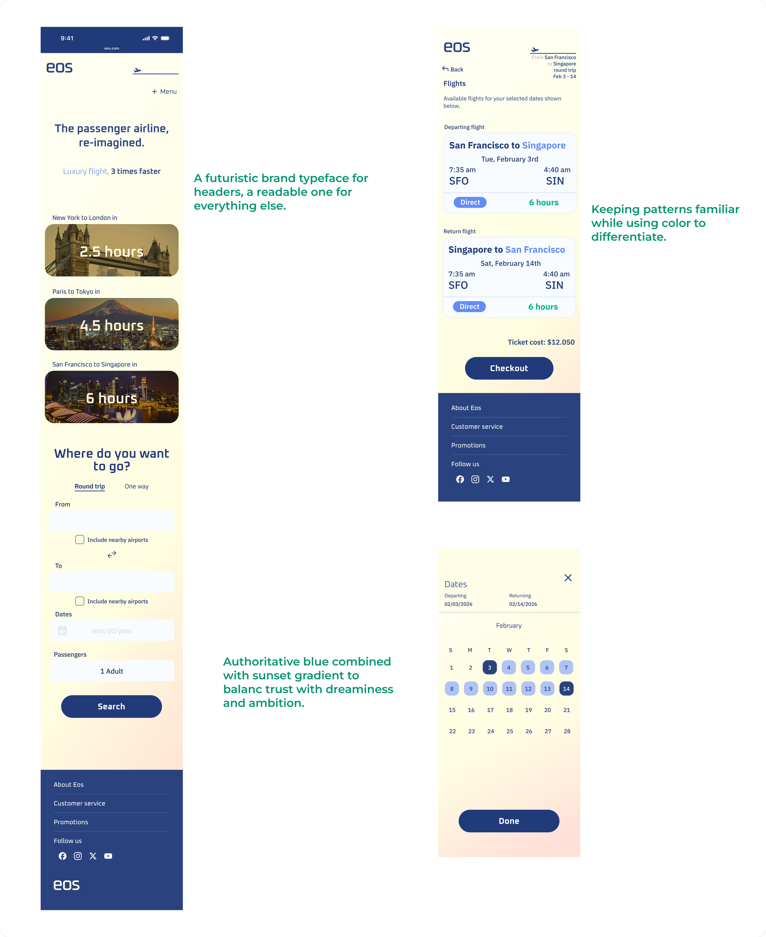
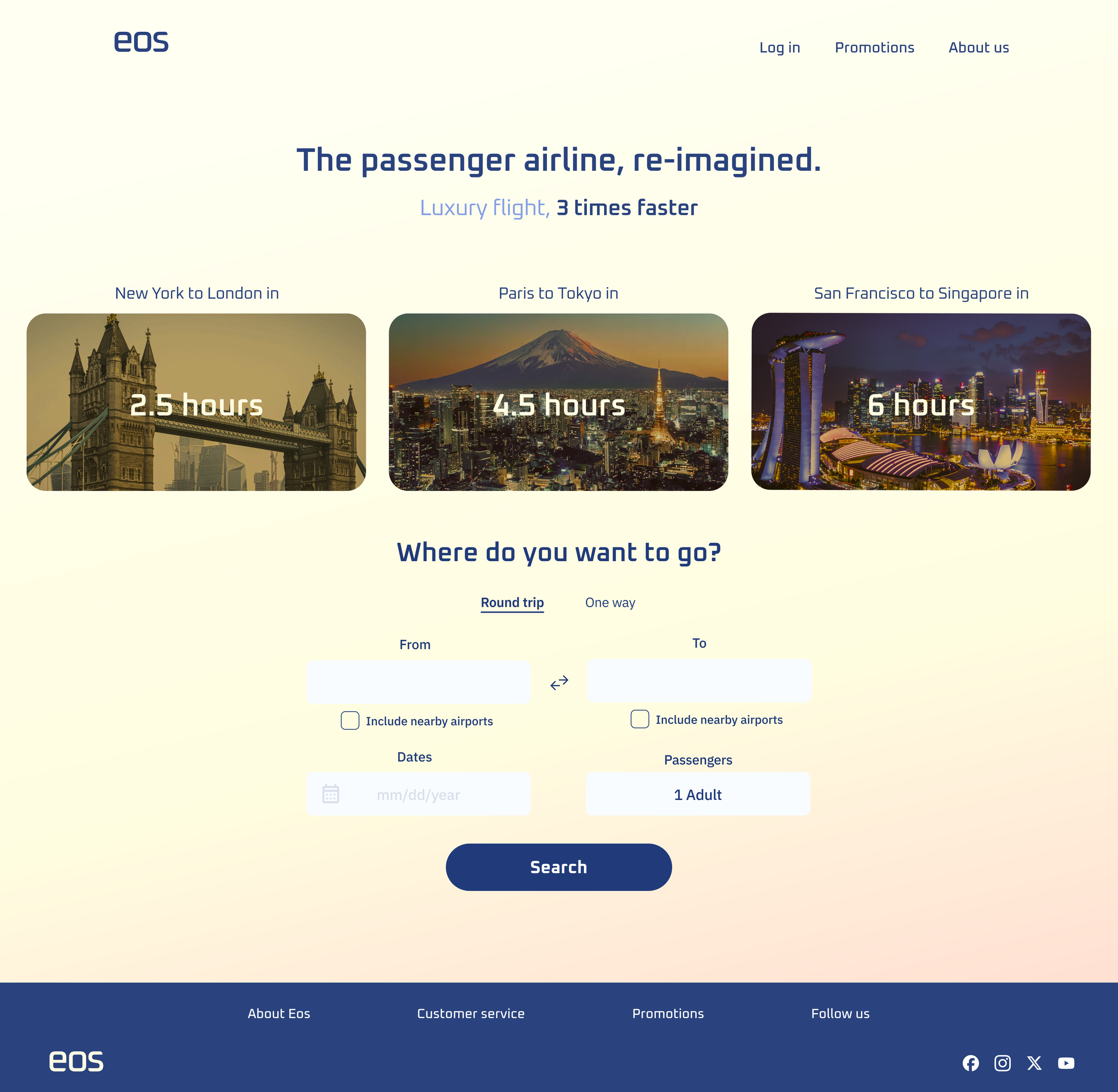
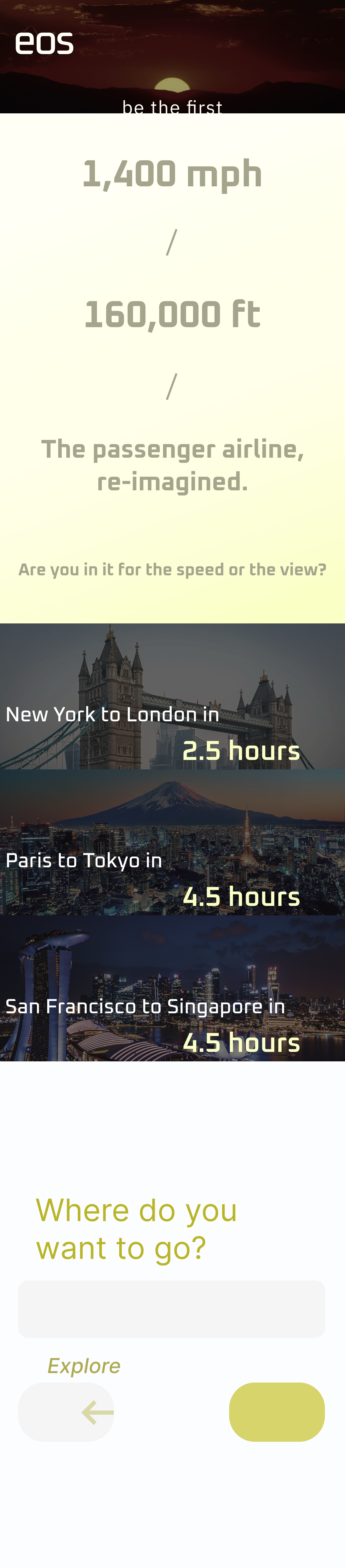
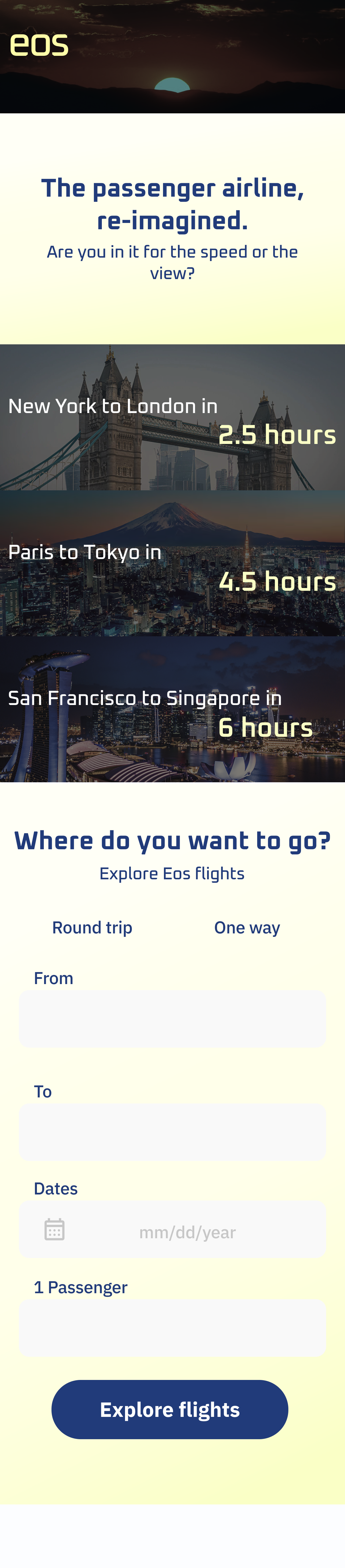
Eos is a fictional airline whose aircraft reach sub-orbital altitudes, making intercontinental travel dramatically faster — San Francisco to Singapore in 6 hours. The project brief called for a mobile-first, responsive web design covering flight search, booking, and online check-in.
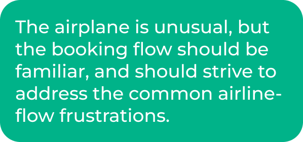
What made this interesting was the tension at the center of it: the product is genuinely unlike anything travelers have experienced, but the task of booking a flight is something they've done dozens of times. Those two things needed to coexist without one undermining the other.

The problem
Business travelers need a booking experience that works the way they expect — while also communicating what makes Eos worth choosing over a conventional flight.
The solution
A streamlined booking and check-in flow built around users' existing mental models, with Eos' story told through the landing page and visual design rather than the checkout process.
Research


User Interviews
I interviewed 5 frequent and business travelers. My assumption going in was that anxiety around a new kind of aircraft would be the central concern to design around. That turned out to be wrong.
"If the airline is operational, they must have passed a rigorous vetting process by the FAA. I trust it."
"Europe or Asia in under 2 hours? That feels amazing and futuristic."
Participants were largely excited, not skeptical. They assumed FAA approval meant the aircraft was safe, and they didn't need to be sold on that idea. What they did bring up, unprompted, were frustrations they'd carried from booking with conventional airlines:
Being quoted one price at the start of the booking flow, then considerably more after seats and baggage
Being prompted to check in online for international flights, then being told they couldn't
Flight change notifications that were vague about what had actually changed
These weren't concerns about Eos. They were issues that had been normalized across the industry — and a clear area where Eos could do better.
Competitive Analysis
I looked at Delta, United, American Airlines, Boom Supersonic, and Spike Aerospace. Among the traditional carriers, Delta's search experience was the strongest — autofilling your departure airport, clean filter controls, and expandable checkout sections that kept the flow digestible. American had the most friction: confusing upsell prompts at multiple points, and outbound and return flight screens so visually similar that some users thought the system was repeating itself.
The supersonic competitors were instructive in a different way. Boom had a polished, well-produced brand site — but no booking experience yet. Spike's design simply didn't match the ambition of their product. Neither had built a booking experience that felt worthy of this category of travel.
Personas
I built three personas from my research.
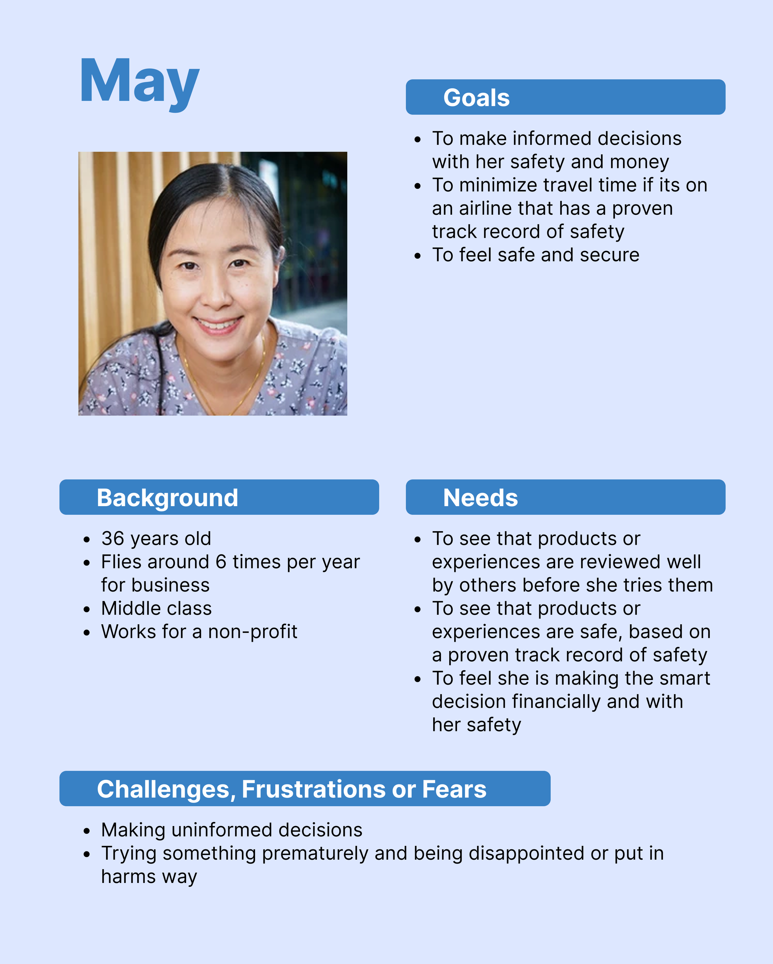
May is a middle-class business traveler who flies around 6 times a year and makes careful decisions around safety and value.
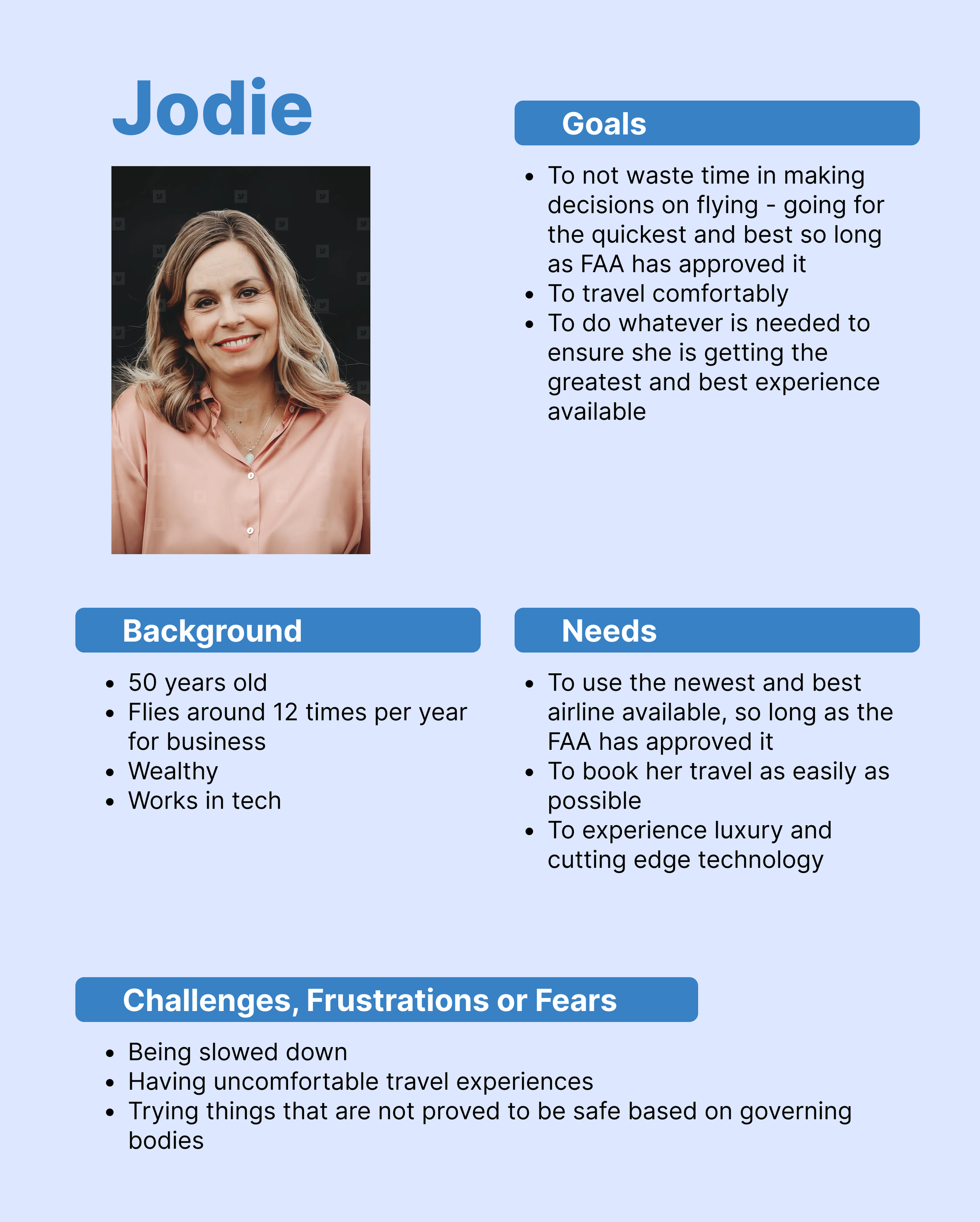
Jodie is efficiency-first, and trusts the FAA to vet the technology on her behalf.
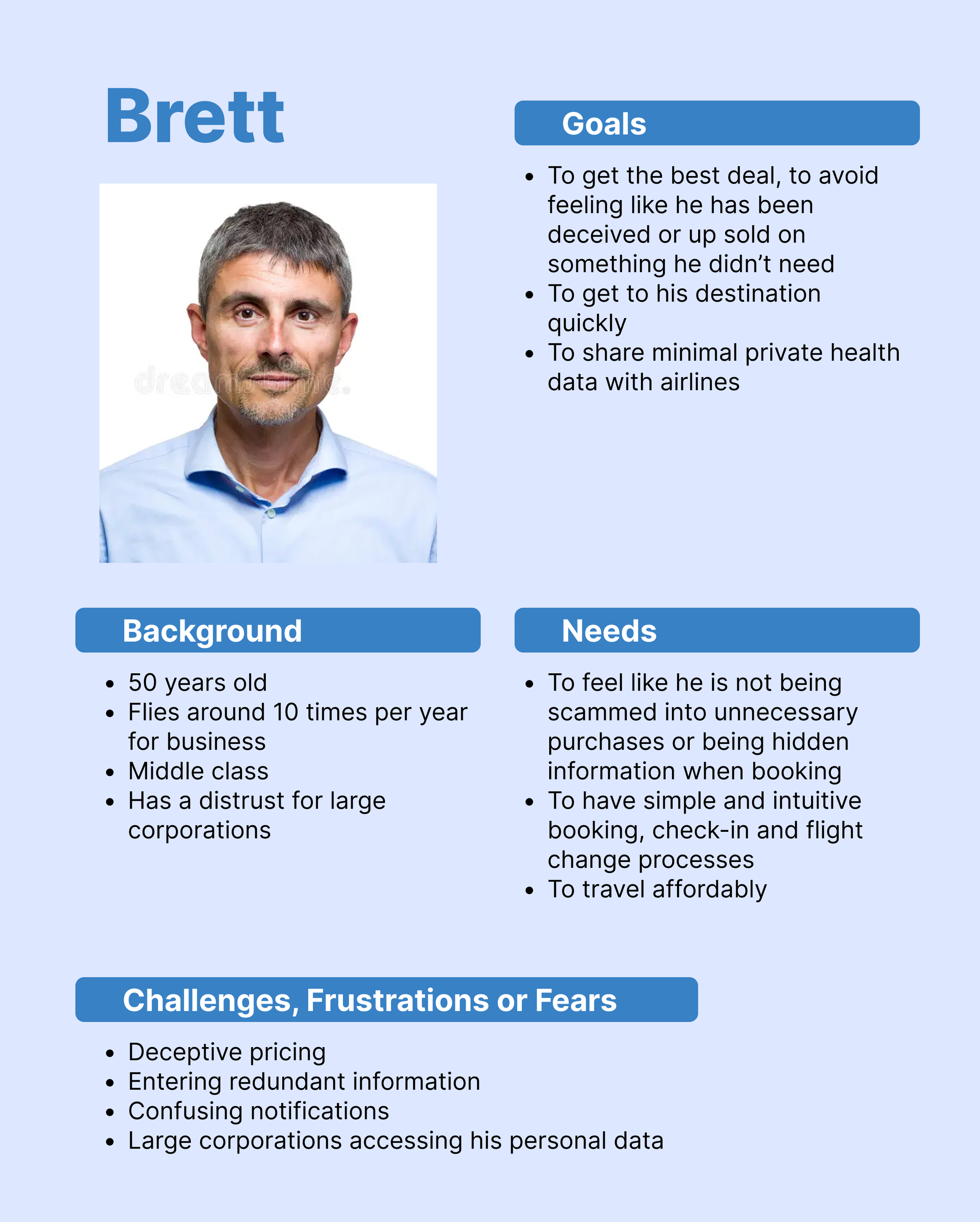
Brett is a pragmatic, privacy-conscious frequent traveler who distrusts large corporations and has no patience for deceptive pricing or redundant flows.
All three shared the same core expectation: a booking process that works the way they already expect it to.
Insights
Ideation

Problem Statements
Business travelers need to be educated on the safety and benefit of high altitude and high speed flight
Business travelers need to get to their destinations as fast as possible, so time savings and how it translates into personal benefit needs to be communicated to them
Travelers are used to frustrating booking flows with traditional airlines, so Eos needs to differentiate itself from these
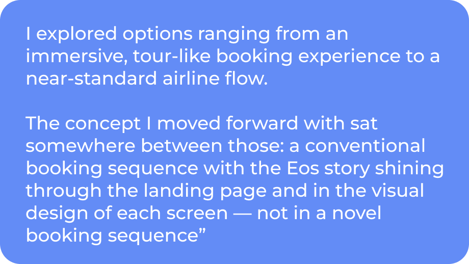
I explored options ranging from a fully immersive, tour-like pre-booking experience to a near-standard airline flow. The concept I moved forward with sat between those: a conventional booking sequence with the Eos story living on the landing page and in the visual design of each screen — not inside checkout.
The Design Strategy
Defining the Solution
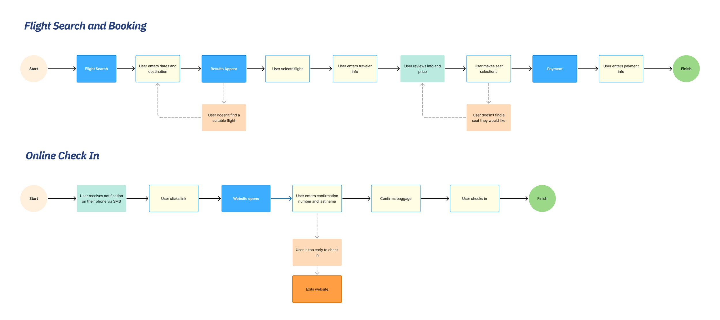
User Flows
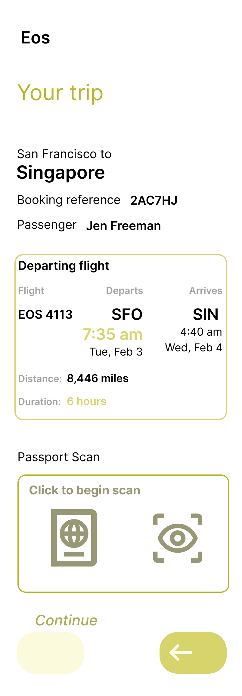
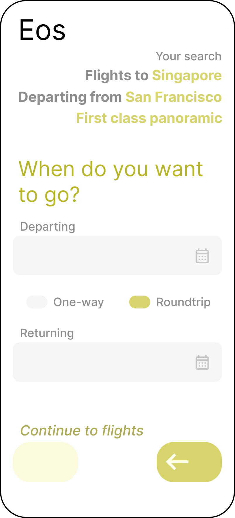
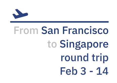
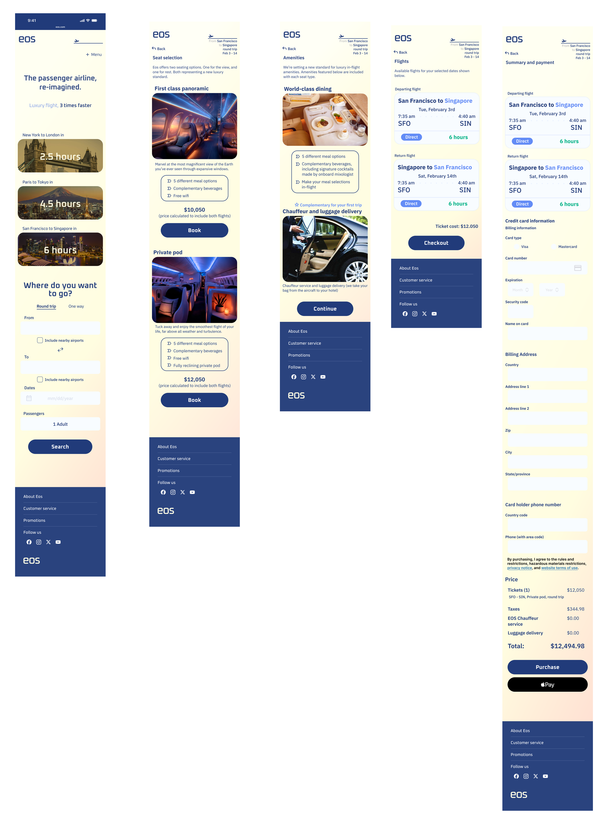
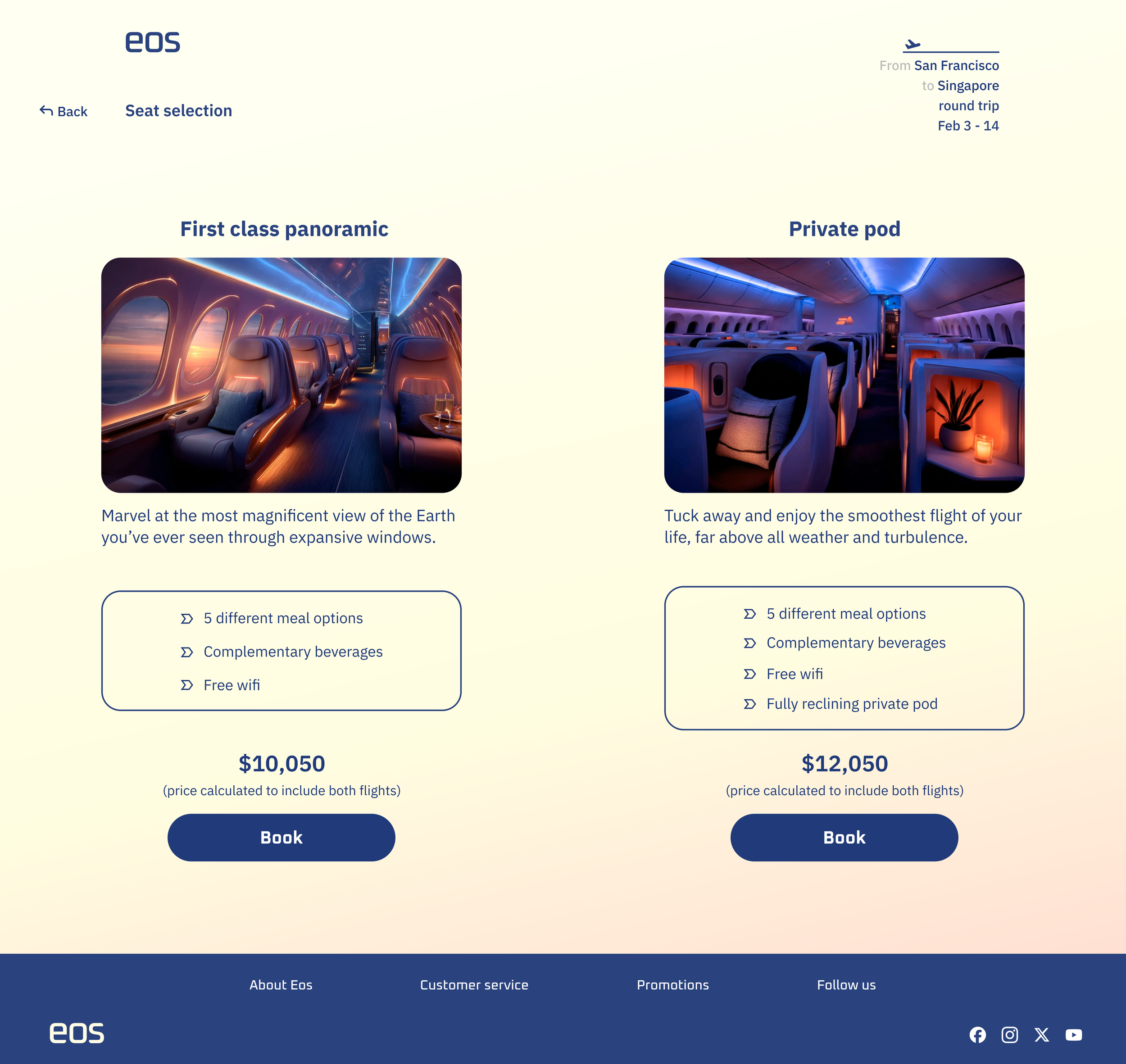
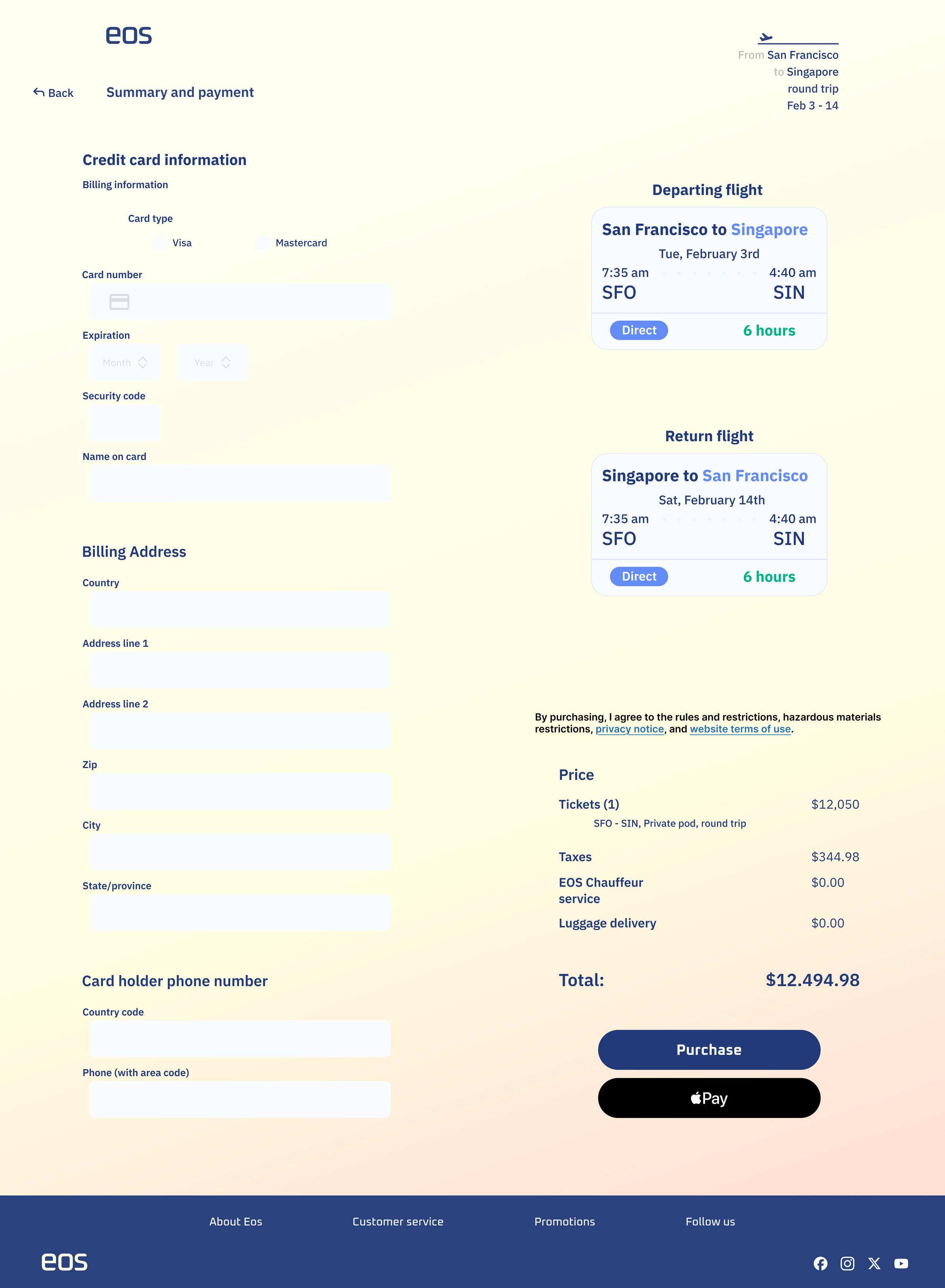
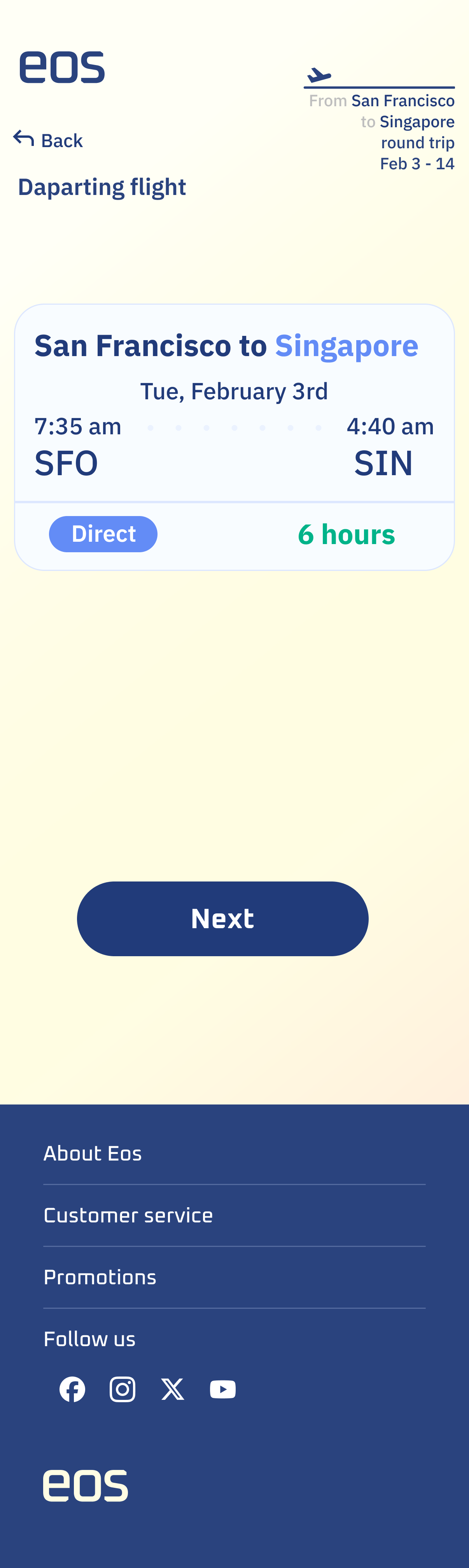
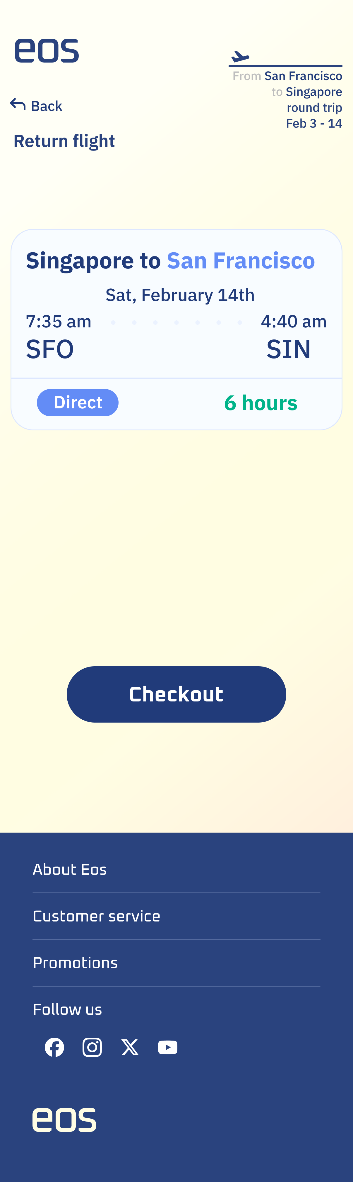
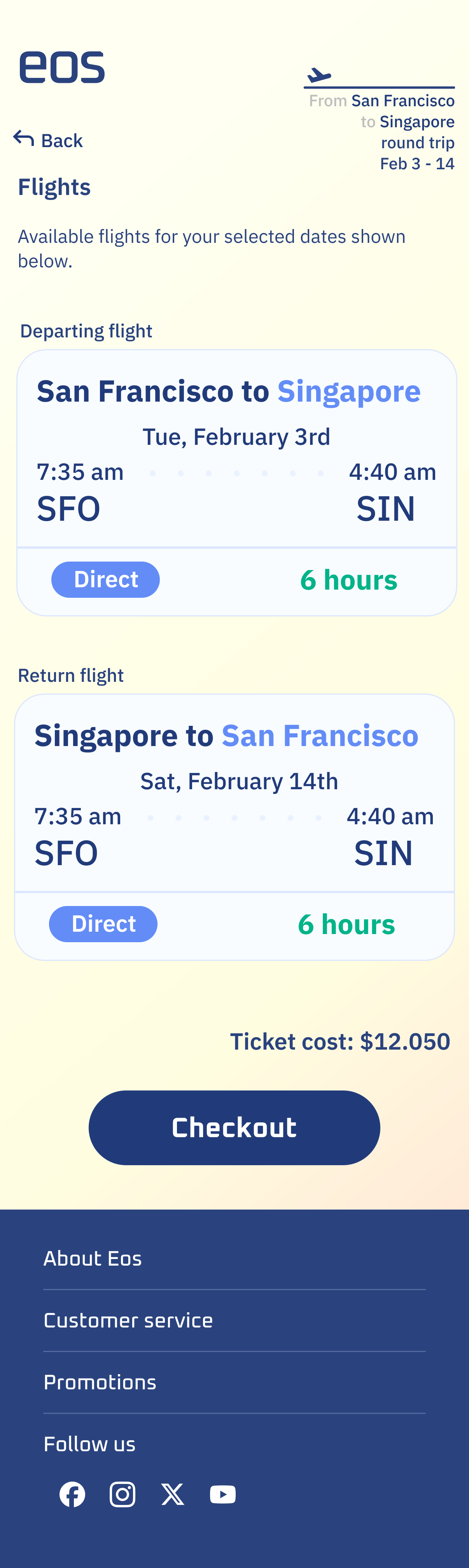
I mapped two task flows: search and booking, and online check-in. For booking: search → select flight → choose seat type → review details and price → enter traveler info → pay. Pricing visible before personal information is ever requested. For check-in: SMS notification → link opens mobile site → confirm booking → confirm baggage → done. No re-entering information already submitted at booking.
Decision Point
The original mid-fi concept used a "tour-like" sequence — gradually introducing the product before getting to booking. Every participant in testing was confused by it. The sequence didn't match their mental model, and the experience of being disoriented before you'd even started booking wasn't one worth defending.
I rebuilt the flow to follow the standard order: search, select, seat, review, pay. The landing page and visual design carry the brand story. The checkout flow does its job and gets out of the way.
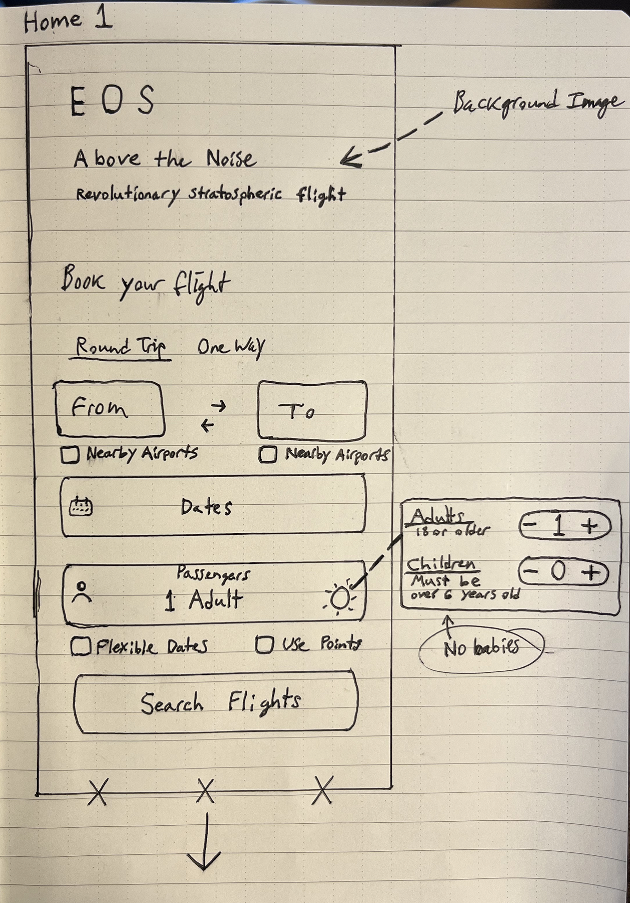

Wireframing
Starting from rough sketches, I moved into mid-fidelity screens to test structure and hierarchy before committing to any visual design decisions. The mid-fi phase was where the most significant structural choices were made — and reconsidered.

Brand Design
The visual direction needed to feel premium and calm. I chose deep navy as the primary brand color: grounded and authoritative, similar to the trust-evoking blues used by other commercial airlines.
Typography was chosen to balance a “space travel” feel with the readability a multi-step booking interface requires.


High Fidelity Wireframing
The high-fidelity phase was where I invested the most effort on this project. Structure had already been resolved in mid-fi — high-fi was the opportunity to differentiate Eos visually, through the hierarchy, spacing, and feeling of each individual screen.
Mobile
Desktop
UI Component Library
I wanted to create components that reflected the sleek brand identity, but also felt subtle and out of the way. Frictionless—like an Eos airplane flying above atmosphere.

Prototyping & Usability Testing
I tested with 5 participants across two rounds — mid-fidelity and high-fidelity. The first round surfaced major structural problems. The second helped with refinement.
Mid-Fidelity Testing
What worked
Participants were genuinely interested in the product concept. The check-in flow had no notable issues.
What didn‘t work
Price needed to appear much earlier — before personal info was ever requested
Safety content mid-checkout increased concern rather than reduced it
Speed and altitude metrics didn't land — needed to be framed as time savings
"Be the first" was too vague — participants read it as cut-off text, not a tagline
Iterations made
Rebuilt booking sequence to follow the standard airline order
Replaced the slide-to-progress interaction with a standard button
Moved safety content out of the booking flow
Reframed messaging around time savings, not technical specs
High-Fidelity Testing
What worked
All 5 participants completed both tasks without difficulty
The booking sequence felt natural and expected
Visual design was well-received
What didn’t work
Departure and return flight screens looked nearly identical — several participants weren't sure the screen had changed
Price dropped off after the selection screen, when participants wanted to keep seeing it
It wasn't clear that amenities applied to both seat types — participants wanted to go back and check the other option
Meal language during check-in implied the user needed to make selections immediately, not on the flight
Iterations made
Combined departure and return flight details onto one screen
Reminded user of pricing throughout flow
Added a callout clarifying that amenities apply to both seat types
Updated check-in meal copy to clarify selections happen on the flight
Final Design
The final prototype covers the complete booking and check-in experience, from the landing page through payment confirmation and same-day check-in. Three key screens were also made responsive for desktop.
Key Learnings
The biggest thing I took from this project was a lesson about assumptions. I went into research expecting to find fear and skepticism about this new kind of travel.
What I found was excitement. And because I assumed the wrong problem, I had designed toward it — putting safety messaging front and center in a flow where it didn't belong and where it actually made things worse.
The other lesson here was about the limits of originality in interaction design. I wanted the Eos booking experience to feel as distinctive as the product itself. But trying to make the flow feel novel — a different sequence with different interaction patterns — created confusion. People book flights constantly. That routine is deeply familiar, and there's no version of disrupting it that feels premium rather than confusing. The novelty of the product is enough. The booking flow doesn't need to be.
What I'm most proud of is the visual design work. I got deep into the typographical hierarchy and spacing on this project. Learning to start from a strict grid and break from it deliberately made a meaningful difference in how the final screens felt.