

A social connection service for immigrants.
BelongHere
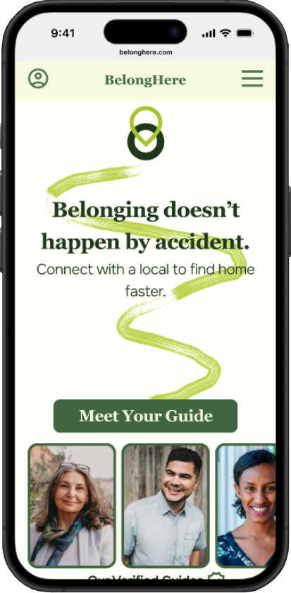
My goal with this project was to create a minimum viable product for a concept I was excited about.
Role: Product Designer
Tools: Figma
Timeline: 8 weeks
Background
Each year, 30-40 million people permanently relocate to a new country. All of these people face similar challenges in trying to make a new place home.
The Problem
Create a social connection service that brings immigrants together in person with locals to help overcome cultural barriers and get introductions to communities they resonate with.
The Solution
Research
User Interviews
I conducted virtual interviews with 4 immigrants who had relocated to a new country within the last 3 years.
“Getting used to the culture is the hardest part...fitting in and feeling comfortable here took time”.
“If it wasn’t for meeting my partner here, I would have left by now. It’s so hard to live someplace and have no one”.
In their own words:
I also researched existing tools aimed at helping immigrants relocate.
Competitive Analysis


I discovered that while solutions exist for choosing a suitable location, accessing services and finding accommodation quickly, there was a gap in the market: something that helped with understanding practical things about culture and social assimilation.
Insights
While research participants voiced a range of challenges, two patterns emerged which didn’t have existing solutions: the practical dimension of becoming familiar with the culture and place, and the social dimension of finding meaningful connections.

The personas

After considering the differences in needs between my two personas, and further considering the market opportunities, I decided that from this point forward my designs would exclusively address Lena’s needs.
Arturo’s needs are in the areas of taxes and law. And while his challenges are real, they are already well met through access to information on the internet and immigration services.
Lena’s need for social connection as an outsider did not have an adequate existing solution, so I decided this was the area where my designs could have the greatest impact.
DECISION POINT
Ideation
Point-of-view statements
I’d like to help immigrants find others in their local community who share their interests, hobbies or opinions because these are the foundations of meaningful connections, and our world has an epidemic of loneliness.
I’d like to help immigrants feel at home in their new communities faster, because cultural nuances are difficult to understand in a short timeframe.
How-might-we questions
How might we help immigrants find others who speak their same language in their local community, and who share their interests, hobbies or opinions?
How might we help immigrants to overcome their hesitation and lack of confidence to engage with the local community and connect with others?
How might we come up with new ways of matching immigrants together with other immigrants in order to unlock an easier way to create meaningful relationships in their new home?

Using these how-might-we questions and point-of-view statements as guides, I engaged a few ideation techniques, such as timed ideation sessions with a certain constraint, such as “concepts around nature” or “concepts around games”.
After coming up with many possible solutions, I went forward with the concept that I felt would best address my persona’s needs the:
A social connection service that brings immigrants together with local volunteers, following a structured itinerary designed to help the immigrant feel at home faster.
Defining the Solution
Information Architecture

In order to protect against my own assumptions, I did a card-sort exercise with 5 participants in order to validate the best choice for architecture.
Sitemap
By mapping a research-validated site structure early on, I could go into wire framing confidently, knowing the product was organized intuitively and was not skewed by my own assumptions.
My goal with the architecture was to put getting matched with a guide at the center of the user experience. So user flows and CTAs all point to the achievement of this goal. The supporting goal was to build enough trust with the user that they felt comfortable enough to meet their guide in person.
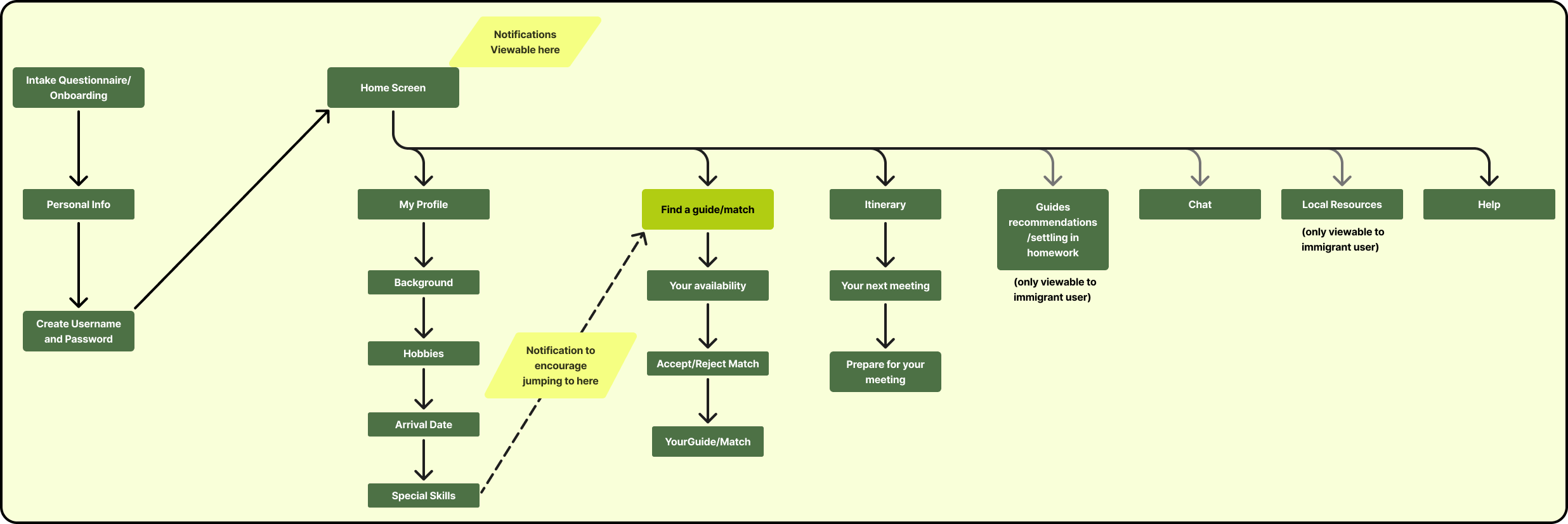
DECISION POINT
I decided to remove “profile creation” as a task separate from the guide-matching process.
Instead, beginning the guide matching process becomes the very first CTA, and inputting personal details and preferences was the first part of that flow.
This streamlined the user experience in alignment with the product’s primary goal—getting matched with a guide.

Mapping the user’s path through key tasks to ensure they’re as simple as possible.
Task Flows

Visualizing the solution and defining hierarchy on each page.
Wireframing
Brand Design
Color Palette and Typography


I chose greens to evoke friendship and trust, and soft yellowish green to evoke hope and joy.
Typefaces were chosen to be friendly, approachable, trustworthy and readable.
Icons

“Get Matched”
“View Itinerary”

Logo Evolution
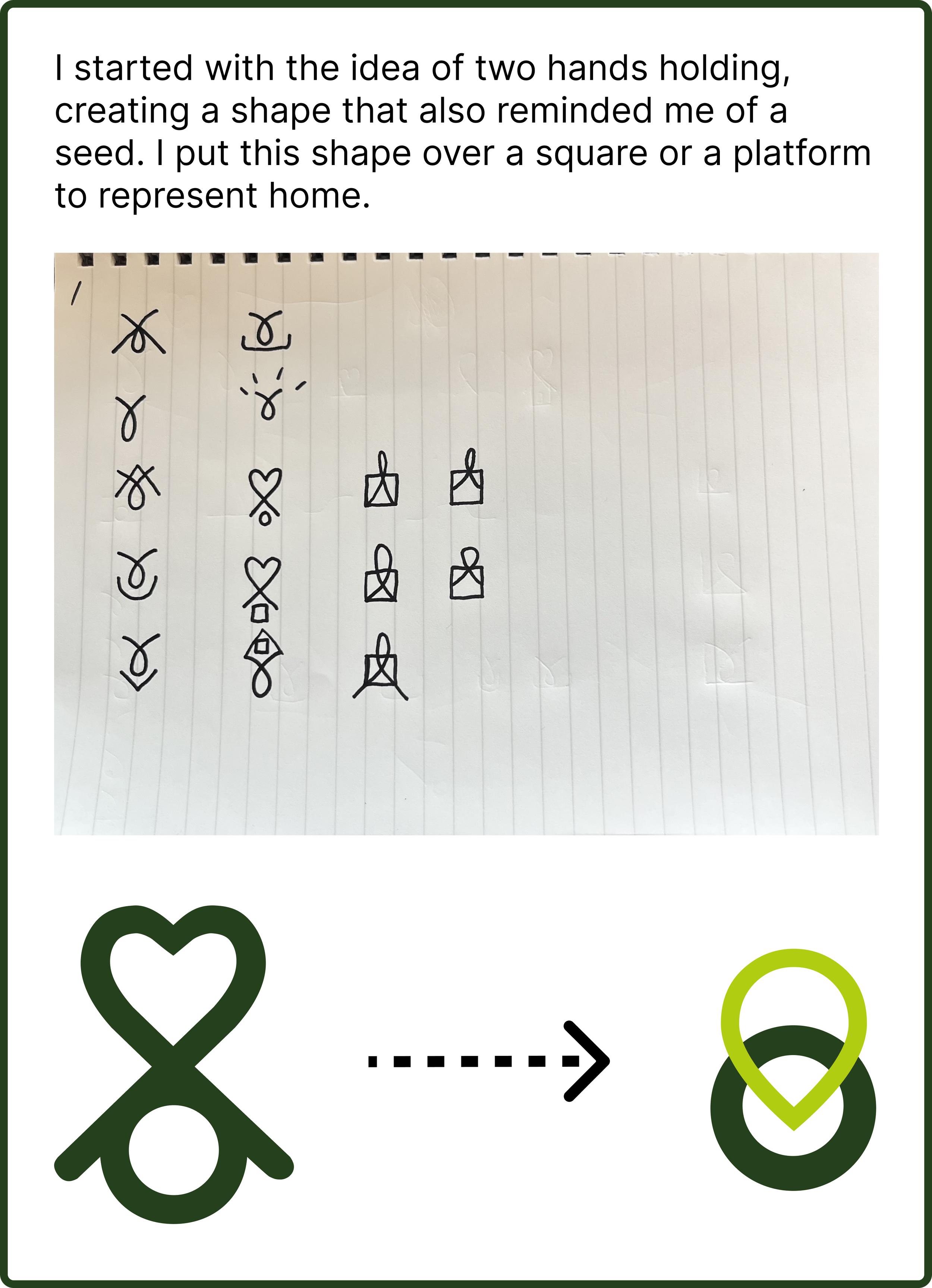
My initial logo contained a heart. But through usability testing, I learned that this was confusing users, since it mislead them to think the product had to do with dating.
I came up with a new concept composed of a “location pin” to represent place, and kept the circle from the old concept to represent peace. The two shapes intersect to evoke belonging and groundedness.
High Fidelity Wireframing


Bringing visual design choices into the wireframes.


My goal was to create reusable components that consistently reflected the brand identity, while remaining simple and functional.
UI Component Library
Prototyping and Usability Testing

Testing my design choices with 5 participants.
*Presented here are the versions of the prototype I used at this stage.
Compare to the final version linked at the top or bottom of this page.
Key Learnings from Testing
Visual design was consistent
Task flows were clear and the happy path was found by all participants
What worked
Confusion about what the product did, due to logo and a lack of a concise explanation upfront
Concern about the guide form matching them correctly, because it asked more about the guide than it did themselves
When asked to view and confirm details for their first meeting, unsure if they need to do the same for other meetings
What didn’t work
Reconceptualized the logo
Rethought the matching form to ask more about the immigrant’s preferences than preferences they had for their guide
Added a concise explanation of the value proposition upfront